Best Excel Tutorial
Excel Skills Simplified: Tutorials That Actually Work
How to Create Min/Average/Max Column Chart in Excel
In this Excel charting tutorial, you will learn how to create a column chart with min average max values in Excel. You’ll discover how to visualize minimum, average, and maximum values using a professional column chart format with step-by-step instructions.
How to Create a Chart with an If Statement in Excel
In this Excel charting tutorial, you will learn how to create a chat with if statement. The if condition in Excel is created in the data series. They can be used as checkboxes to change the charts as per the requirements.
In Excel, you can use an if statement to create a chart that dynamically changes based on the value of a cell. This is a useful technique for creating charts that can be customized to show different data sets.
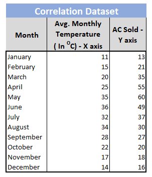
How to Make Correlation Graph in Excel
Correlation helps to identify the pattern of change between two variables. It has two properties – strength and direction. It is a common statistics concept which can be easily represented in Excel using a scatter chart and a trend line.
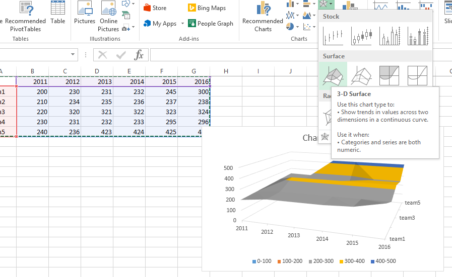
How to Make Wireframe Contour Chart
In this Excel tutorial, you will learn about the creation of a wireframe contour chart.
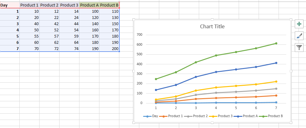
Chart with a single x-axis but two different ranges
In this charting tutorial, you will learn how to create an Excel chart with multiple ranges on a single x-axis to display multiple data series with different value ranges.
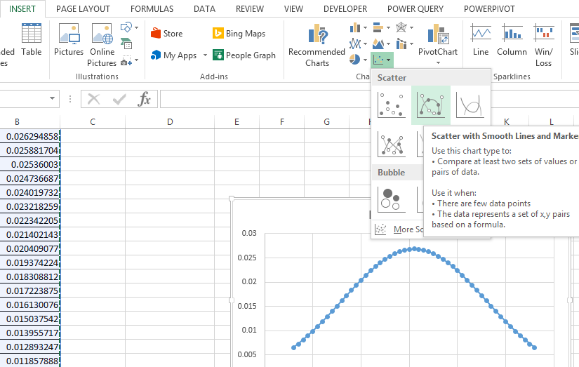
How to create a bell curve in Excel
A bell curve is a symmetrical distribution that is often used to represent the normal distribution of data. We will learn how to create a bell curve in Excel.
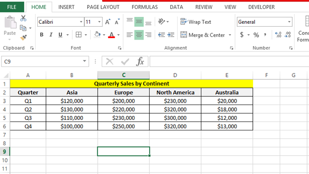
How to Create a Quarterly Chart in Excel for Sales Data Analysis
In this Excel tutorial article, I show you how to create quarterly charts in Excel.
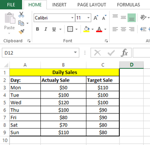
How to add target line to Excel chart
In this Excel charting tutorial, I will show you how to add a target line in an Excel chart. This is a way to compare actual performance against a goal or benchmark.
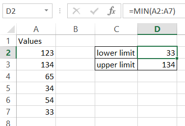
How to Create a Chart with Upper and Lower Control Limits in Excel
In this Excel tutorial, you will learn how to create a chart with upper and lower control limits. It is ideal for Six Sigma style quality control dashboards.