How to Make a Scatter Plot in Excel: Beginner’s Guide to XY Charts
A scatter plot can be used to show the correlation between two different variables X and Y. By using the points in the plot, the recipient can easily infer how these variables relate to each other.
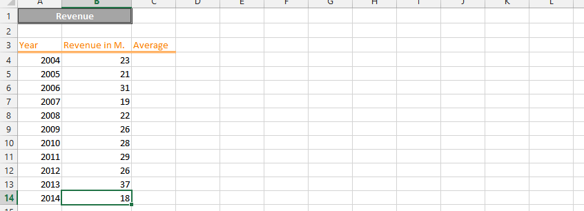
For example, a scatter plot can show the relationship between a company’s revenue and net profit.
To insert a Scatter Plot in Excel, follow these steps.
There are five different types of scatter charts in Excel:
- Scatter
- Scatter with Smooth Lines and Markers
- Scatter with Smooth Lines
- Scatter with Straight Lines and Markers
- Scatter with Straight Lines
Another kind of a scatter chart is a bubble chart.
Data preparation
Scatter plot data requires a specific structure. You need two columns of numerical values – one for each variable you’re exploring. Column A might contain X values and Column B might contain Y values. Each row represents one observation, with the two values side by side. Include a header row with descriptive names so Excel can label your axes automatically.

In this simple case, you can see the collected data on employee rates and performance. We would like to see if there is a correlation between them. The scatter plot should enable us to do this.
Inserting a scatter chart
Click Insert after selecting the entire dataset (A2 through C9 in this case).

Choose Scatter under the Charts group to select the XY (Scatter) chart type.

Choose the desired design for your chart.

Newly created XY chart:

Scatter Chart Formatting
Adding axis titles
Let’s start formatting our scatter plot.
The first thing I miss are axis titles. In our case, the horizontal axis is rate, and the vertical axis is performance. We are aware of this, but the person who does not have access to the data does not know it. In this case, we need to add axis titles to avoid the recipient misunderstanding the chart.
To add an axis title, click on the chart, then on the little green plus that appears on the right and select the axis titles option.
As you can see, text boxes next to the axis have been added. Click on them and enter the axis titles. Unfortunately, Excel did not do this on its own.
There is also a possibility to link axis titles with cells. In such situation title of your axis will be taken from the cell.

This is how the Scatter Diagram looks like with titles of axes.
Adding chart title
A chart needs a title. Let’s change it to name your diagram. What would be a graph without the name?
The rule is the same. Double-click the text field above your chart and enter the chart title.
The title should briefly describe the content of your chart. For scatter charts it is a good idea to name it “relationship between X and Y”. It is also possible to enter multiline chart title but it will decrease the size of what you want to show itself.

In case you don’t need the chart title you can remove it. To do that click your chart and click the small green plus sign on the right hand side from your diagram. Simply, untick the Chart Title option to remove it.
Data labels
Optionally, you can decide to add data labels to your scatter graph.
To do this, click on the chart, select the little green plus sign, and select Data Labels. The data labels appear in the chart. Right-click one of them and select Format Data Labels.
There are only three options here that are worth considering:
- Series Name
- X Value
- Y Value

I recommend that you only add data labels when there aren’t too many of them. I prefer things to be short and simple so I don’t like showing too much information on the chart.
Error Bars
Suffice it to mention that such an option exists.
Error bars do not look good on scatter charts. 
Error bars might be useful when the precision is the case in your example. The rate may be equal to 7 but in reality it may differ from 6.3 to 7.6, so it’s worth showing it on the screen.
Gridlines
It is extremely important to choose the grid format that best suits your chart.

In my simply example minor gridlines are absolutely obsolete. In your case, they can be crucial.
To remove gridlines from the diagram, simply uncheck all options. I will keep the main grid lines both vertical and horizontal.
Trend line
Trendlines are only an essential part of your scatter charts if you care about the future. For charts that only show dependencies, you don’t need to worry about trendlines. If you want to predict a future relationship, you must add at least one of them.
Adding a trendline is the same as with the previous formatting options, so just select the appropriate option to add a trendline to your chart. Additionally, Excel will ask which data set (X or Y) is needed. I chose a rate trend line.
A trend line has appeared on the chart. Right-click on it and select Format Trendline. Here you may notice a few options you may want to set.

I figured my trend was linear, so I chose Linear Trendline. I also don’t think the distant future is easy to predict, so I decided to only predict 2 more periods. In most cases, you’ll enter a larger number here.
Displaying the equation on the graph is a must for me. The equation appears on the graph for me.
You may prefer Display R-squared value on the chart.
To set intercept tick the dedicated option. You will see additional line in the chart which will try to reach 0 point (or any other chosen) backwards in my case.

You may also notice that linear trendline information has been added to the chart legend at the bottom of the chart.
You can add more than one trendline. You can even add a trendline for each variable in your dataset.


Leave a Reply