How to Make Wireframe Contour Chart
In this Excel tutorial, you will learn about the creation of a wireframe contour chart.
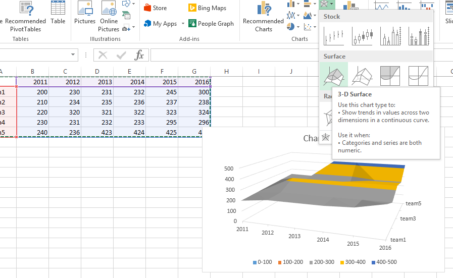
How to insert Wireframe Contour Chart
The first step in creating a wireframe contour chart is to prepare your data. Make sure that you have a set of x and y values, along with the corresponding z values that represent the height of the surface. You can create a set of test data or use real data from your own research or experiment.
Next, create a 3D surface chart using your data.

The chart will look like this.

What is Contour Chart
3-D Surface chart shows a 3D view of the data, which can be imagined as a rubber sheet stretched over a 3D Column chart.
It is typically used to show relationships between large amounts of data that may otherwise be difficult to see.
Color bands in a Surface chart:
- Do not represent the data series
- Indicate the difference between the values
A Wireframe 3-D Surface chart is a 3D Surface chart shown without color on the surface. This chart shows only the lines. Such a contour plot is not easy to read, but it can plot large data sets much faster than a 3D Surface chart.
Now change it to a wireframe 3D chart: right‑click the chart, choose Change Chart Type, and then select Wireframe 3‑D Surface.

In the same way, you can also create a contour chart in Excel.


Leave a Reply