How to Make Correlation Graph in Excel
Correlation helps to identify the pattern of change between two variables. It has two properties – strength and direction. It is a common statistics concept which can be easily represented in Excel using a scatter chart and a trend line.
What is Correlation Chart?
Correlation Chart is a type of graph or mathematical scheme that uses Cartesian coordinates for display values typically of two variables for a data set. The data is displayed as a collection of points, each with the value of one position variable on the horizontal axis and the value of a second position variable on the vertical axis.
Direction of Correlation
Positive:
If the correlation coefficient is positive, it shows a direct proportional relation between the variables and an upward slope of the correlation graph.
If variable 1 increases, variable 2 will also increase – and vice versa.
Negative:
If the correlation coefficient is negative, it shows an inverse proportional relation between the variables and a downward slope of the correlation graph.
If variable 1 increases, variable 2 will also decrease – and vice versa.
Create Correlation Chart in Excel
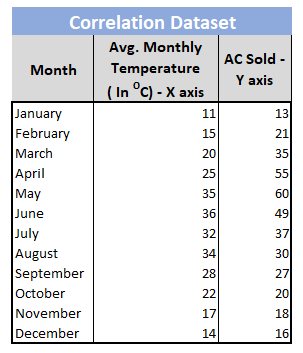
Step 1: Create the correlation dataset. The independent variable should be in the left-hand side (X-axis) and the dependent variable should be in right-hand side (Y-axis).

Step 2: Select the column for X-axis and Y-axis.

Step 3: Insert -> Charts -> Scatter

Step 4: Name X-axis and Y-axis. Name the chart.

Step 5: Right-click on any datapoint. Add a trendline.

Step 6: Select the most suitable trendline. Check the following boxes as shown below.

Step 7. Format your trendline.

Step 8: The final Correlation Graph is created.
Generate Correlation Direction to Find Positive/Negative Relation
Syntax: = Correl(array1, array2)
Where:
Array1 is the first data range of values.
Array2 is the second data range of values.
Value in Example Above:


Errors:
- #N/A: If the two arrays are not same in length
- #DIV/0!: If either of the array is blank or standard deviation of the numbers is 0.


Leave a Reply