How to add target line to Excel chart
In this Excel charting tutorial, I will show you how to add a target line in an Excel chart. This is a way to compare actual performance against a goal or benchmark.
To add a target line to an Excel chart, you can use the following steps:
First, create a simple chart showing the daily sales of a company, then create a simple bar graph for the same.
Prepare Your Data
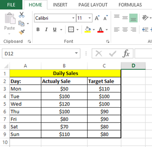
This is the daily sales data for a company. As shown in the Excel file:

Chart creation
Creating a simple bar chart from the Actual Sale data:

Clicking on the 2D clustered column chart.

Add the Target Data to the Chart. Right-click on the chart area and click Select Data.

Click Add in the legend entries.

Select the series name by clicking on the cell with the name target sale and select series values from the column with target sales data.

Click Ok to close the Edit series window.

By default the target sales are added as columns. To convert it into a target line right-click the target series and change the chart type.

Change option for Target sale to Line:

Click Ok to apply changes.

To format the target line, right-click on the line and select Format Data Series. Select the Line tab and choose the line style, color, and width you want for the target line.
To add a label to the target line, go to the Layout tab on the Excel ribbon and click on the Data Label button in the Labels group. Select the Values option to show the target value as a label on the line.
To make the target line stand out, you can change its color and style to make it more prominent. You can also add a label to the line to show the target value.
This technique of combining different chart types (columns and lines in this case) is a powerful way to visualize different types of data within a single chart, allowing for effective comparisons and insights. You can further customize the chart by adjusting axis labels, titles, and other formatting options to enhance clarity and presentation.
Please find attached the Excel file or chart with the target line.


Leave a Reply