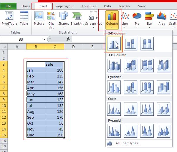
How to Make a Column Chart in Excel
Column charts are a popular and effective way to visualize data in Excel. In this Excel tutorial, you learn how to insert and format a Column Chart.
Excel Skills Simplified: Tutorials That Actually Work
Column charts are a popular and effective way to visualize data in Excel. In this Excel tutorial, you learn how to insert and format a Column Chart.
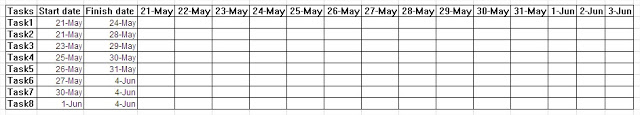
In this lesson, you will learn how to create a Gantt chart.
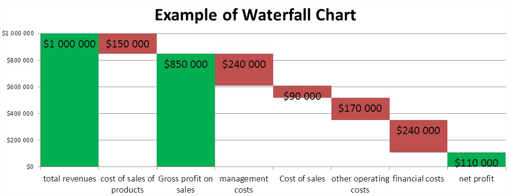
In this tutorial, you’ll learn how to create a waterfall chart in Excel step-by-step.
In this lesson, you can learn how to plot line chart in Excel.
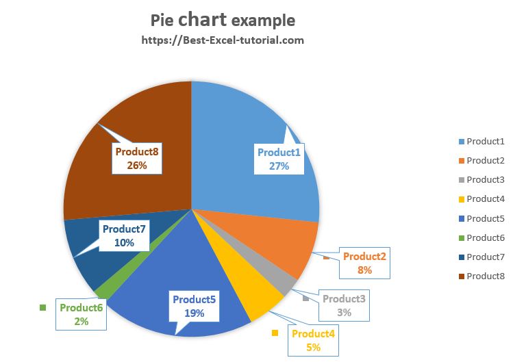
In this lesson, you can learn how to insert pie chart in Excel.
A pie chart is often used at home, office and business. Its popularity comes mainly from the transparency of the presented data. A pie chart is best suited to show the data as part of a whole.
For example data about sales you can create pie chart like this:

In this Excel tutorial, you will learn what a gauss chart is and how to insert it. The chart is also known as a normal distribution chart or a bell curve.
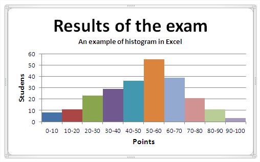
In this lesson, you will learn what a histogram chart is and how to plot one.
