How to Create a Chart with Upper and Lower Control Limits in Excel
In this Excel tutorial, you will learn how to create a chart with upper and lower control limits. It is ideal for Six Sigma style quality control dashboards.

Excel Skills Simplified: Tutorials That Actually Work
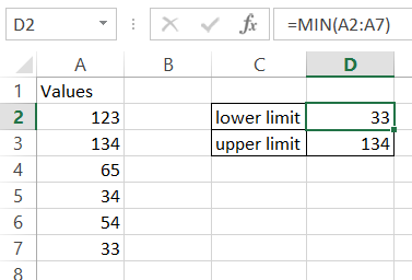
In this Excel tutorial, you will learn how to create a chart with upper and lower control limits. It is ideal for Six Sigma style quality control dashboards.

In this Excel charting tutorial leasson, you will learn how to create a chart with number and percentage. You will need it to show both numbers and part of a whole or change using percentage.
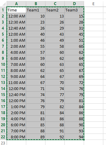
In this Excel charting tutorial lesson, you will learn how to create an Excel chart with hours in the best way possible.
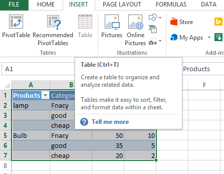
We will learn to create graphs which can be handled by data filters to look more easy and customizable.
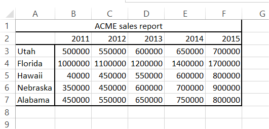

In this article, we will try to learn the method for creating charts with confidence interval in Excel.
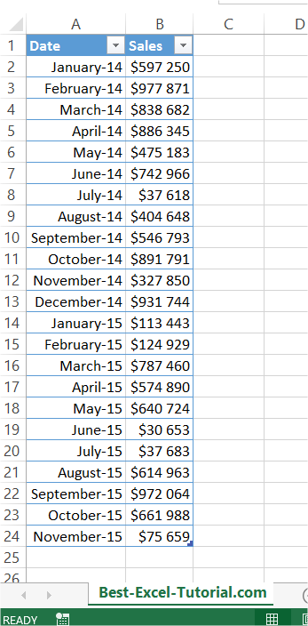
In Microsoft Excel, you can add an average line to a chart to show the average value for the data in your chart. In this Excel tutorial, you will learn how to create a chart with an average line.
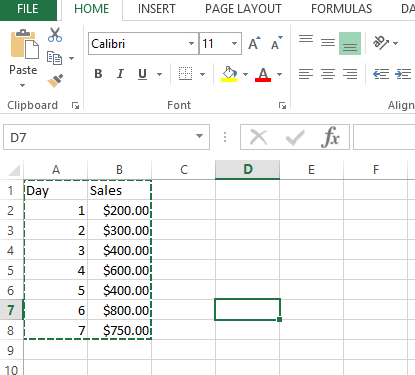
In this charting tutorial, we will create the Excel chart with arrows. To create a chart with arrows in Excel, you can use a combination of the built-in chart types and custom shapes.
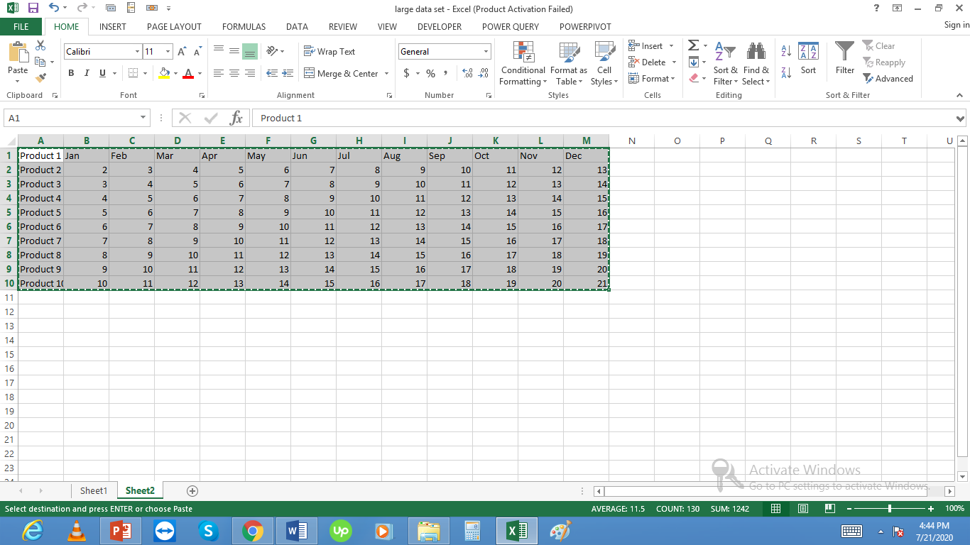
We will create charts with lots of data. We will start with simple chart creation and then move on to more complex charts with large amounts of data in them.
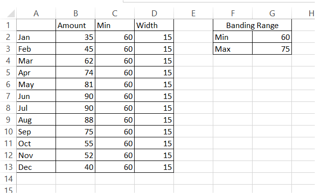
In this Excel tutorial, you will learn how to create a chart with horizontal bands. Adding horizontal bands can be useful for visualizing thresholds, target zones, or performance levels on a chart.