How to disable close button userform?
In this Excel VBA tutorial lesson, I will show you how to disable the close button in an Excel userform. Let us first look at the close button we use in Excel userforms:
Excel Skills Simplified: Tutorials That Actually Work
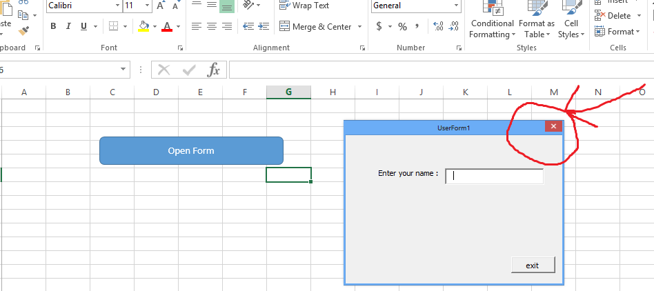
In this Excel VBA tutorial lesson, I will show you how to disable the close button in an Excel userform. Let us first look at the close button we use in Excel userforms:
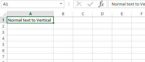
Usually we are writing horizontally, but sometimes there is a need to rotate text vertically or at an angle. I will show you how to write vertically in an Excel file. We will type horizontally, as we normally do, and then we will use different options to rotate the data as per the requirements.
Such cell formatting might be needed to increase visibility or for sophisticated presentations that you may be making.
In this Excel tutorial lesson, I will guide you through the different ways to quickly get to the last row of Excel.
An .xlam file is an Excel add-in file that contains macros, functions, and other custom code. In this article I will guide you how to import an Add In (xlam) file to Excel.
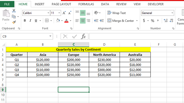
In this Excel tutorial article, I show you how to create quarterly charts in Excel.
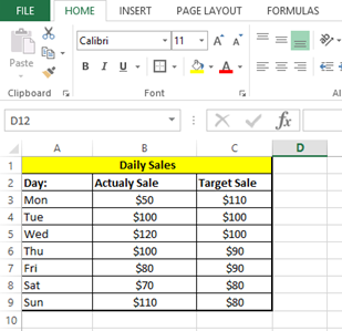
In this Excel charting tutorial, I will show you how to add a target line in an Excel chart. This is a way to compare actual performance against a goal or benchmark.
Reversing the order of your Excel data is a common task for reordering lists, prioritizing recent entries, or preparing data for specific analysis and presentations. Whether you need to flip a single column, multiple columns, or an entire spreadsheet, Excel provides several efficient methods to reverse data order while preserving data integrity and relationships between rows.
In this tutorial, you will learn different methods for flipping an Excel spreadsheet upside down without losing any of your data or formatting.
The VLOOKUP function in Excel lets you search for a value in the first column of a table. It then returns a value from another column in the same row. When working with data across multiple Excel files, you might need to reference data from a different workbook. This guide explains how to use VLOOKUP across workbooks in Excel efficiently.
Linking Excel spreadsheets to Word documents is valuable for creating comprehensive reports where detailed narratives accompany numerical analysis. Specifically, whether you need to reference Word documentation from your Excel data, embed Word content within your spreadsheet, or maintain connections between files for automatic updates, Excel offers multiple methods to integrate these two essential Office applications. Here are the most effective approaches you can use.
Creating a professional quotation format in Excel helps in presenting a clear, concise, and professional outline of services or products offered, along with their prices. Here’s how you can create a quotation format in Excel: