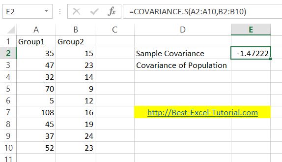
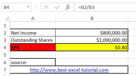
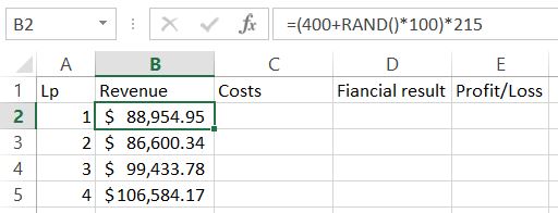
Earnings Per Share Calculator in Excel
Earnings per share (EPS) is a financial metric that measures a company’s profitability. In this lesson, you will learn how to calculate EPS in Excel.
Excel Skills Simplified: Tutorials That Actually Work

Earnings per share (EPS) is a financial metric that measures a company’s profitability. In this lesson, you will learn how to calculate EPS in Excel.

In this comprehensive lesson, you will learn how to calculate ROIC in Excel using the return on invested capital formula and understand how to measure business efficiency and profitability.

In this comprehensive lesson, you will learn how to calculate ROCE in Excel using the return on capital employed formula and understand how to measure business efficiency and profitability.
Return on Sales (ROS) is a financial ratio that measures a company’s efficiency in generating profits from its revenue. It is calculated by dividing the operating profit (or income) by the net sales. A higher ROS indicates greater profitability and better control over costs.
In this tutorial, I’ll show you how to calculate ROS in Excel with a simple ROS formula. All you need are two inputs: operating profit and net sales. Alternatively, you can use EBIT (earnings before interest and taxes) as a proxy for operating profit and revenue for net sales.

ANOVA, short for Analysis of Variance, is a powerful statistical technique for analyzing differences between groups. In this Excel tutorial, you’ll learn step-by-step how to perform an ANOVA two-factor without replication in Excel and master this essential Data Analysis Toolpak method.

The antilog, also known as the inverse logarithm, is a mathematical operation that can be used to reverse the effect of a logarithm. In Excel, the antilog can be calculated using the EXP function, which returns the exponential value of a given number. In this Excel tutorial, you will learn how to handle antilog in Excel.
Standardizing data in Excel transforms values in a dataset so they have a mean of zero and a standard deviation of one, using z-score normalization techniques. This data normalization process, also known as normalizing or z-scoring, makes the data consistent and suitable for statistical analysis and data preprocessing.

Box and whisker charts, also known as box plots, are valuable statistical tools for summarizing and visualizing data distributions. We demonstrate how to create and customize box and whisker charts in Excel. We also explore the advantages of using these charts and provide insights into interpreting them.

A treemap chart is a chart that displays hierarchical, tree-structured, data using nested rectangles.
In this Excel tutorial, you’ll discover how to perform a comprehensive three-factor ANOVA in Excel and master statistical analysis of multiple factors.
ANOVA (Analysis of Variance) is a powerful statistical method for analyzing complex datasets, allowing you to examine how multiple factors simultaneously impact your data. By using the three-factor ANOVA in Excel with the Data Analysis Toolpak, you can efficiently evaluate factor interactions and main effects.