How to Make Surface Chart
You are going to learn how to insert a surface chart, and it will be easy to perform.
Excel Skills Simplified: Tutorials That Actually Work
You are going to learn how to insert a surface chart, and it will be easy to perform.
This Excel tutorial guides you through the process of inserting and formatting a Radar Chart, also known as a Spider Chart or Web Chart.
You will learn how to do mathematical calculations and how to create a Q-Q plot in Excel, also called a probability chart (to be exact, it is a normal distribution probability plot).
The calculation of BMI (Body Mass Index) is purposely meant to know if the person has a normal, overweight, or obese weight. This is possibly done by certain components that make the BMI calculation a possibility. We will now build a comprehensive BMI calculator in Excel and execute the formula calculations to analyze body mass index values.
When creating a mortgage calculator, it is important to consider everything that would make the mortgage profitable for your company. In this guide, we’ll teach you how to create a mortgage calculator in Excel together in a step-by-step format. We will not just create it, but also calculate it.
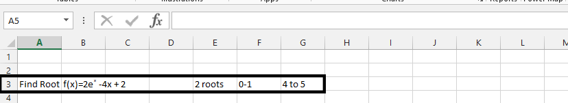
The setup of the bisection method is about doing a specific task in Excel. With the bisection method, we are going to find the root of a given function.
The vlookup function can easily help you determine if a value that is in one column is in another.
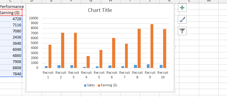
Inserting chart title from a cell in Excel can easily be done, and we are going to do it together. In this Excel tutorial you will teach yourself how to insert dynamic chart title from the cell.