How to calculate p value in Excel
In this Excel tutorial, you will learn how to calculate p value in Excel.
Excel Skills Simplified: Tutorials That Actually Work
In this Excel tutorial, you will learn how to calculate p value in Excel.
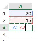
In this Excel tutorial, you will learn how to subtract.
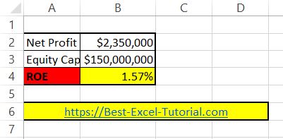
In this lesson, you will learn how to calculate ROE in Excel.
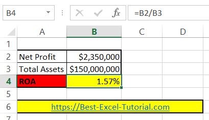
In this Excel tutorial lesson, you will learn how to calculate ROA in Excel.
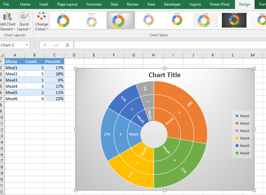
A sunburst chart is a hierarchical chart that uses concentric circles to represent data. It is a great way to visualize large amounts of data and show relationships within a hierarchy.
In this article, we will show you how to create a sunburst chart in Excel. We will also discuss the benefits of using a sunburst chart and how to customize it.
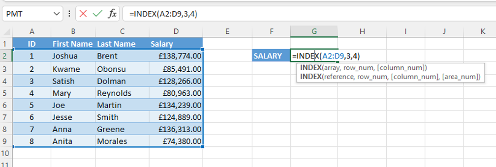
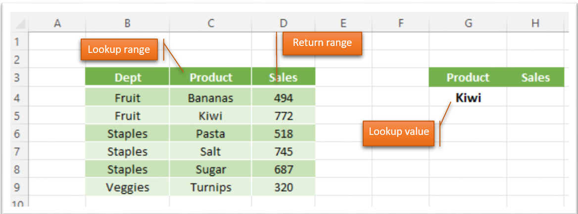
There are many functions in Excel that are useful in a variety of situations. Two of the most popular functions in Excel are the INDEX and MATCH functions. These functions can be used to look up values in a table or range of cells. Understanding these functions gives you the tools to make your data work for you.
In this Excel tutrial, you learn how to use the trapezoidal rule in Excel.
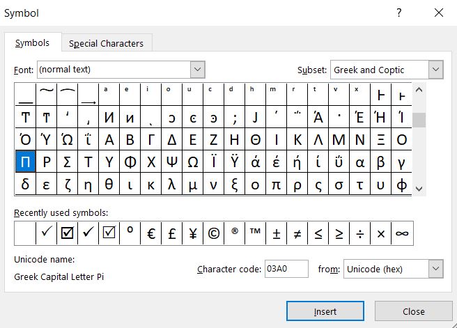
In this tutorial, you will learn how to use Pi in Excel.
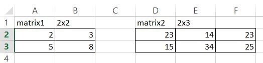
In this Excel tutorial you teach yourself about matrix multiplication in Excel. You see how to use MMULT Excel function to multiply matrixes.