How to Make a Kite Chart in Excel
Kite charts are unique graphs that display changes in species abundance or data distribution along a measured line often used in ecological studies and field surveys.
Unlike standard charts, a kite chart reveals how values rise or fall at specific locations, making it easy to visualize patterns across a habitat or transect.
In this step-by-step tutorial, you’ll learn exactly how to create a kite chart in Excel, so you can effectively present and analyze your survey or environmental data.
Gathering Data
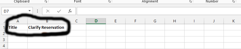
It is important to make sure that critical data is laid out correctly on the spreadsheet of your Microsoft Excel.
Write “title” on one column, and what you would like the title to be on the column beside it.

Write names of your column headings.

These are the original kite values that we have outlaid. You are to decide on your own kite values.

Necessary Calculation
To simplify the kite chart creation process in Excel, we will now perform the essential kite diagram calculations and data offset adjustments required for accurate visualization.
The marked area is the place where we have put the value of the kite line offset. As you have seen, there are gaps in between the numbers in the marked area.

The highlighted area in the image above displays the values for your kite chart data. This area corresponds to the top row for each species, directly beneath the Right, Left, and Center labels on the left side of your Excel sheet.
For Excel kite chart data entry, click each marked column and enter the formulas “=A4”, “=B4”, and “=C4” as needed.

Click on the column marked as number 1. Calculate the kite offset value (D3 in this case) by adding the original kite value marked in red and subtracting the kite line datum. For Excel kite chart offset calculation, enter the formula directly into the column as shown.

There is a small square beside number 1. Pointing there with a mouse would show a small plus symbol. Click and hold onto that square, and then drag it down. This would automatically change the calculation.

Click on the column that is directly under the kite line datum, which is 10. This is the one marked as number 1, and then type in the same thing that is showing in number 2. It is assumable that you are using the same columns that we are using in this one.

Click and hold on the small square beside the one labeled at number 1, and drag it down.

Select the column labeled “number 1” and enter the formula shown at number 2, then press Enter. Locate the small square beside number 3, click and drag it downward to copy the formula to additional cells. This Excel fill down formula cells technique automatically calculates values for each row.

We are going to click on the column marked as number 1, and then type in the information shown in number 2, and press enter.

Click on the result to see a small square. Click and hold onto it, and drag it down for automatic calculation.
You should click on the column marked as number 1, write the same thing as shown in number 2, and press enter. Once you press enter, you will see a small square that you can drag down, as we did before.

Select the column labeled number 1, highlighted in green, and enter the formula shown as number 2. Replace the cell references (C4, H3, and so on) with the actual columns containing your kite chart data. For accurate kite chart cell reference mapping, ensure all data values match their corresponding cells in your spreadsheet.

Making Data Fancy
It is about making the right adjustments that make it easier to create the kite chart.
Mark the columns, as marked in number 1, and go to the home tab, which is marked as number 2. Finally, choose the Cell Styles, as it is marked as number 3, and finally choose the style, as it is marked as number 4.

You should repeat the same thing to make the scene look like that shown in the picture below.

Creating the Chart
We are going to create the chart.
Mark the columns, as in this case, we marked D4:I13 to cover all areas.

Click on the insert tab, as it is shown in number 1, and then choose from the recommended charts. You could alternatively click on the alt, as it is the area charts.

There is a kite chart creation that would make it possible to further develop the kite chart.

Creating Kite Chart
We do have a chart ready, but it is not a kite chart. We are going to finalize the details and make the chart ready.
Click on series 2, as marked in number 1, and then choose number 2 to choose the same color as the plot area.

Click on the plot area, as marked as number 1, and then choose the color that matches the plot color, as marked as number 2.

Click on the plot area, as labeled as number 1, and then change the color to the same as the plot color, as number 2.

We are now going to delete series 2, series 4, and series 6 by selecting each one of them and pressing delete.

Changing Series Names
We are now going to change the series 1, 3, and 5 as they are currently shown on the chart we created.
Right-click on the legend, as it is marked as number 1 in the picture shown above, and choose select data, as marked as number 2.

Click on series1, as it is part of the three legends we left, after deleting series 2, 4, and 6. This is the one labeled as number 1, and then click on edit, which is number 2, and then click on Ok.

Click on the column under “series name”. It is number 1, and then click on the column with the series name, which is labeled number 2, and then click okay, as labeled number 3. You should repeat this step with series 3 and 5.

Here is an example of a professional kite chart created in Excel, displaying the symmetrical chart design with data visualization:

Even though we have deleted series 2, 4, and 6, it does not affect the details. The data is still intact.
That was an Excel charting tutorial on how to create and how to tweak a Kite Chart.


Leave a Reply