How to Make a Pareto Chart in Excel
You will learn how to create a Pareto Chart in Excel. This is an example:

The Pareto diagram consists of both a column chart and a line chart. It presents a graphic incidence of certain factors (e.g., causing complaints or defects). It is used mainly for quality control, to show what the focus is to get the best results (e.g., the elimination of one defect may reduce the number of complaints by half).
Table of Contents
Pareto Principle
The Pareto Diagram was the invention of the Italian economist Vilfredo Pareto. During his research, he concluded that 80% of the country’s wealth is held by only 20% of the population. In this way, the so-called Pareto Principle, which is based on the proportion of 20:80, is isolated. According to the Pareto Principle:
- 20% of clients, including 80% of complaints,
- 20% of the effort results in 80% of the effects,
- 20% of customers generate 80% of the company’s revenue,
- 80% of the complaints are caused by 20% of the causes.
Many examples of the Pareto Principle exist. Its simplicity makes it useful in various fields, including quality management.

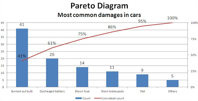
First, you will need a data table. Focus on quality management. A simple example of a Pareto Diagram is a table where we can find the most common car damage. In this example, they are: light bulbs burned out, dead battery, blown fuse, worn brake pads, flat tire, and others. The table should include both the count and the cumulated count (preferably in percentage terms) of individual data points.
How to insert the Pareto Chart?
Then, create a chart. Use a column chart in Excel.

The chart is unreadable because the data values are very different. Add a second series of data to increase the transparency of the chart. Click on one of the red columns as a percentage of the cumulative amount of (tick all) and select ‘Format data series’ (keyboard shortcut CTRL + 1). A dialog box appears. Select the ‘Plot series on’ and ‘Secondary axis’.

Now, the Excel Pareto chart looks better.

Red columns are still selected. Do not uncheck them, because they change their type. Change the chart type of a column on a line chart. Simply right-click on any of the red columns and select “Change Series Chart Type”. Select the line chart and confirm.

You can even add data labels. Right-click the data series and select “Add Data Labels”.

Add a title, format the axis as needed, and adjust label placement at the bottom.
The Excel Pareto chart is done. The most significant issues should be clearly visible.


Leave a Reply