How to Summarize Survey Results in Excel
In this Excel tutorial, you will learn how to create survey and summarize survey results in Excel.
To summarize survey results in Microsoft Excel, you can use various functions and tools such as Pivot Tables, charts, and statistical functions. Here’s a basic overview of the steps to summarize survey results in Excel:
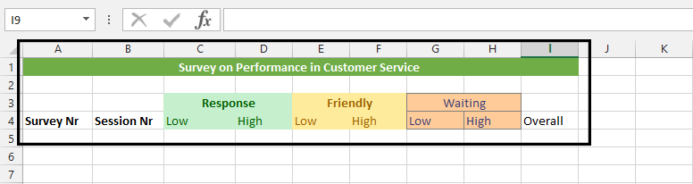
Layout the headers.

Note: Response, Friendly, and Waiting are topics that have sub-topics (low and high). If someone checked 2 on a scale of 1 – 5, then that will get into low, and 3 upward will be on high. The overall is how many people participated in the survey.
Collect the survey results in a table
Input the answer as they were answered by survey’s participants. Organize the data into a meaningful structure, with columns for each question and rows for each survey response.

Click on an empty cell in a, and write Total.

Highlight all the cells with values, exclusive survey nr and session nr.

How to calculate survey results?
Click AutoSum.

Highlight the results and press CTRL + B.

We have just summarized how three hundred people sees the customer service’ performance.
Use Pivot Tables to summarize the data by grouping and aggregating the responses based on certain criteria. For example, you can create a Pivot Table to show the total number of responses for each question or to show the average rating for each question.
Use charts to visualize the survey results. For example, you can create a bar chart to show the distribution of responses for each question or a pie chart to show the percentage of responses for each option.
Use statistical functions such as AVERAGE, MEDIAN, and MODE to calculate descriptive statistics for the survey data.
Create a report or presentation to share the results of your analysis, using charts, Pivot Tables, and other visual aids to present the data in a clear and meaningful way.


Leave a Reply