How to Create a Histogram in Excel
In this lesson, you will learn what a histogram chart is and how to plot one.
Creating a histogram in Excel
The Histogram and the Pareto Diagram are two types of charts connected with quality management that can be created in Excel. A histogram chart is a specialized column chart used to represent the frequency or occurrence of a particular characteristic within a range of values.
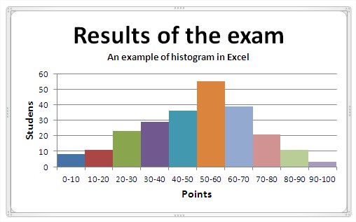
A sample histogram looks like this:

Begin with a dataset that you want to analyze. For example, let’s consider exam scores as shown below:

The main principles for creating a histogram are:
- data should be divided into equal intervals,
- number of compartments should be 5 -15 so that the histogram was clear,
- frequency in any of the intervals should not be equal to 0,
- between the columns is not to be gaps.
First, delete the legend as it will not be needed.

Then you remove the spaces between the columns. Just right-click on the column and choose ‘Format Data Series’. A dialog box appears, where you choose ‘No gap’.

Once the basic histogram is created, it can be customized to improve clarity and visual appeal. Adjust colors and styles to enhance readability according to your preference, accessible through the ‘Chart Styles’ options.
In addition, you must add the data series. The finished sample histogram looks like this:

Creating a histogram using Data Analysis Toolpak add-in
Alternatively, you can use Excel’s Data Analysis ToolPak add-in to create a histogram more efficiently:
- If you haven’t already, enable the Data Analysis ToolPak add-in in Excel.
- Click the “Data” tab on the ribbon and select “Data Analysis” in the Analysis group.
- In the Data Analysis dialog box, choose “Histogram” and click “Ok”.

Fill in the input range with your data, specify the bin range, and select “Chart Output”.
Excel will generate the histogram chart automatically.


IFS
Spot on with this write-up, I really believe this site needs much more attention. I’ll probably be returning to read through more, thanks for the info!