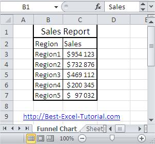
How to Make Funnel Chart
Here, in this Excel charting tutorial lesson, you will learn how to create a funnel chart in Excel.
Excel Skills Simplified: Tutorials That Actually Work
Here, in this Excel charting tutorial lesson, you will learn how to create a funnel chart in Excel.
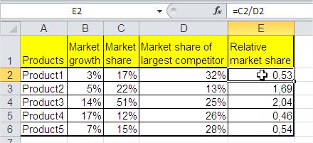
In this tutorial, you will learn how to create a BCG Matrix in Excel. The BCG Matix is a chart that shows the potential of your company’s products. BCG stands for Boston Consulting Group; this company created this chart for the first time.
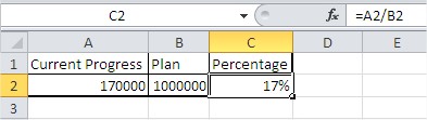
In this Excel tutorial, you’ll learn how to create a thermometer-style chart to visualize goal progress using percentages. For this type of graph, you will want to present data that shows the percentage of a value (e.g., the annual plan for sales or budget usage).
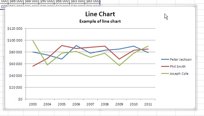
In this lesson, you will learn how to shrink your chart so that it fits on the page. When printing large Excel charts, you might encounter situations where the chart exceeds the page dimensions. While this can pose a printing challenge, Excel provides several methods to resize the chart to fit within a single page, often without significant loss of visual clarity.
Learn how to zoom in on a chart in Excel to enhance visibility and focus on important data points. It will help you improving visibility of values in your graph.
In this Excel tutorial lesson, you will learn what a logarithmic scale is and how to use it with charts.
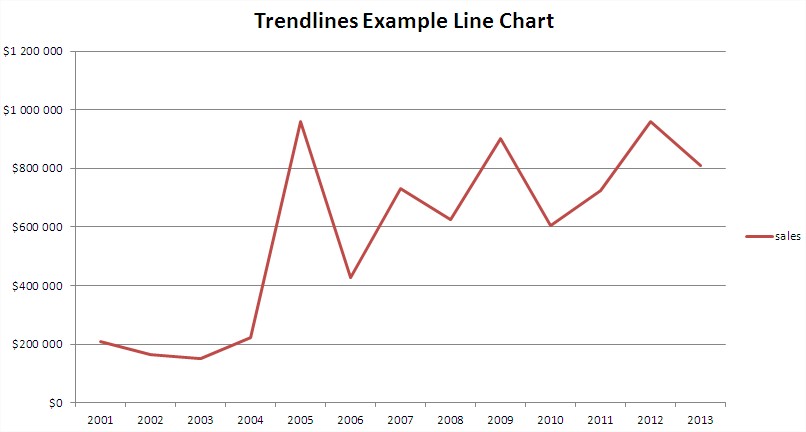
In this Excel tutorial, you’ll learn how to add and use trendlines in Excel charts to visualize data trends.
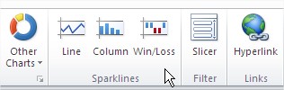
In this Excel tutorial, you’ll learn how to use Sparklines in Excel – mini charts that show data trends within individual cells. Sparklines in Excel provide a fast way to visualize trends in data, making them ideal for dashboards, reports, and financial spreadsheets.
In this lesson, you can learn how to create a pivot chart in Excel.