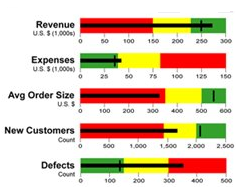
Best Excel Tutorial

The largest Excel knowledge base ✅ The best place to learn Excel online ❤️

four axis chart example

How to make 4 Axis Graph

Radar charts, also known as spider charts, web charts or star charts, are used to evaluate multiple alternatives based on multiple criteria. You need to use a radar chart when you have to display multivariate data in the form of a chart that has three or more axis.

For example, you can use a radar chart to analyze the strengths and weaknesses of a number of supply chain strategies or to compare multiple projects graphically. Given below is a simple radar chart with 5 axes on a scale of 0 to 10.

Read More

Ishikawa Scheme

How to Create Ishikawa Fishbone Diagram in Excel

The Ishikawa diagram, popularly known as the fishbone diagram or the cause and effect diagram, is mainly used in quality management. It is used to analyze inefficiencies of processes. Thanks to the fishbone diagram, we have the opportunity to analyze the problem that is visible in the process.

The Ishikawa Diagram is a tool that will detailly identify the root causes of this problem. In other words, an ishikawa diagram can help identify defects in processes by analyzing the root causes of the problem.

Read More

territory map sample data

How To Create A Territory Map In Excel?

We can create territory maps when we wish to compare statistics visually across multiple geographical areas. An example would be to compare births or tax revenue by state, town, or country.

Once you have acquired and selected the data, Excel generates the territory map and uses differing levels of shading to indicate the level of values by geographical areas in the data.

Read More