How to Create a KPI Dashboard in Excel: Complete Guide with Step-by-Step Examples
Excel Dashboard reports are becoming increasingly popular these days and serve as essential tools for businesses to visualize and analyze data. In this comprehensive tutorial on creating KPI dashboards, they help the reader quickly comprehend raw data by presenting it in virtually rich tables and charts, making them interactive and giving a comprehensive insight into business performance indicators, which makes them easier to change or filter to your preference.
Building a KPI dashboard in Excel is now simpler than ever, and this step-by-step guide requires no additional software or complex tools. If you are looking to master the process of building professional dashboards and want a complete walkthrough on creating KPI dashboards in Excel with practical examples, follow these easy steps below:
Researching your dashboard before you start creating your charts, you may want to conduct a little research to find out which Excel dashboard will be suitable for your project. This will save you a whole lot of time when creating charts and analyzing data.
Table of Contents
Set-Up Your Excel Dashboard File
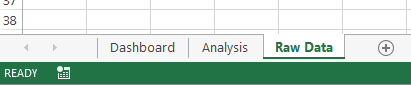
Click the Excel icon and create three sheets in the file. The file will contain; Raw Data, Analysis, and Dashboard.

Import your raw data or copy and paste it if you have it in a place where you can’t import it. Ensure that the data is in tabular format. This will make it easier to compute with tools like COUNTIFS, SUMIFS, and other Excel tools. If the data cannot be set up in this way, the whole computation may be more difficult for you. Your Excel spreadsheet will look like this:

Analyzing your Data
There are lots of data analysis options you can use in Excel. Some of them are: Named Ranges shapes, form controls, conditioning formatting, data validation, Excel tables, and pivot points. You can make use of different formulas as well, including:
- GETPIVOTDATA
- CHOOSE, INDIRECT, OFFSET
- OR, IFERROR, IF
- MATCH, INDEX, HLOOKUP, VLOOKUP
- DMAX, DAVERAGE, DSUM (database functions)
- RANK, LARGE, SMALL, MAX, MIN, COUNTA, COUNT
- COUNTIFS, AVERAGEIF, AVERAGEIF, SUMIFS, SUMPRODUCT
All these tools can be used to manipulate your data, but just a handful of them will be enough to set up your KPI dashboard.
Data Crunching
Now that you are set to finish your analysis, set-up a data table to feed each table or chart on your dashboard. Pivot points or formulas can be used to extract important data. The number of formula combinations you select will depend on the amount of data you are working on. The large amounts of data will require more formulas to speed things up.
If you make use of formulas, then it is important to format the data in the table and work on the data using a structured format.


Leave a Reply