How to create a dynamic pivot table and refresh automatically
To create a dynamic Pivot Table that refreshes automatically, you need to start with data in a table format. The table must have headers, and the data must be in a consistent format.
Excel Skills Simplified: Tutorials That Actually Work
To create a dynamic Pivot Table that refreshes automatically, you need to start with data in a table format. The table must have headers, and the data must be in a consistent format.
Calculating overtime hours in Excel is indeed a useful skill, especially for HR and payroll professionals. The calculation of work overtime is dependent on knowing when an employee starts and when he or she finishes for the day.
In this Excel charting tutorial, you will learn how to make a stock chart in Excel. You can use such a graph everytime you have open, high, low, close data values.
It is a pity that the ogive chart is not a defined chart type in Excel. I sometimes use it and for this reason I have to do an ogive graph step by step. Below I will show you how to easily create an ogive chart in Excel.
There is simplicity in breaking the column of a chart, and we are going to justify this simplicity. Follow along as I demonstrate how to break one column in Excel.
Creating an interactive dashboard in Excel can help you communicate complex data insights in a visually appealing and accessible way. An interactive dashboard allows you to present data from multiple sources, including charts, tables, and pivot tables, and provides users with a way to interact with the data to gain insights and make informed decisions. Follow this steps below to create an interactive dashboard.
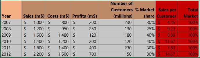
The best way to make a financial estimation is knowing most of the information about the task. Let’s say you want to start a new enterprise, for example.
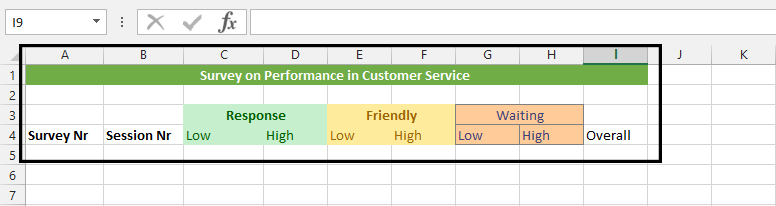
In this Excel tutorial, you will learn how to create survey and summarize survey results in Excel.
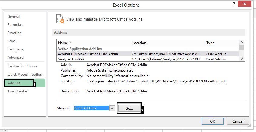
The Analysis ToolPak is an Excel add-in that provides advanced data analysis tools for Excel. To use the Analysis ToolPak in Excel, you need to first install and activate it. By following these steps, you will be able to use Analysis ToolPak add-in.
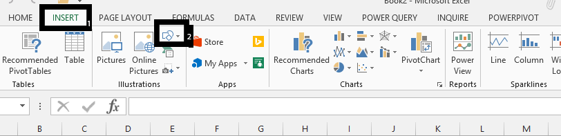
To enhance your Excel worksheet, you can insert drawing objects such as shapes, arrows, or text boxes. Here’s a straightforward guide to inserting and manipulating drawing objects.