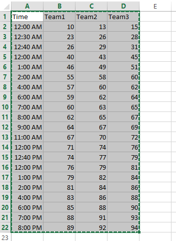
How to Create a Chart with Hours in Excel
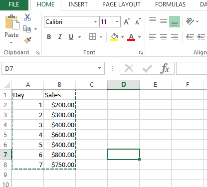
In this Excel charting tutorial lesson, you will learn how to create an Excel chart with hours in the best way possible.
The Largest Excel Knowledge Base ✅ The Best Place to Learn Excel Online ❤️
In this Excel charting tutorial lesson, you will learn how to create an Excel chart with hours in the best way possible.
We will learn to create graphs which can be handled by data filters to look more easy and customizable.
In this article, we will try to learn the method for creating charts with confidence interval in Excel.
In Microsoft Excel, you can add an average line to a chart to show the average value for the data in your chart. In this Excel tutorial, you will learn how to create a chart with an average line.
In this charting tutorial, we will create the Excel chart with arrows. To create a chart with arrows in Excel, you can use a combination of the built-in chart types and custom shapes.
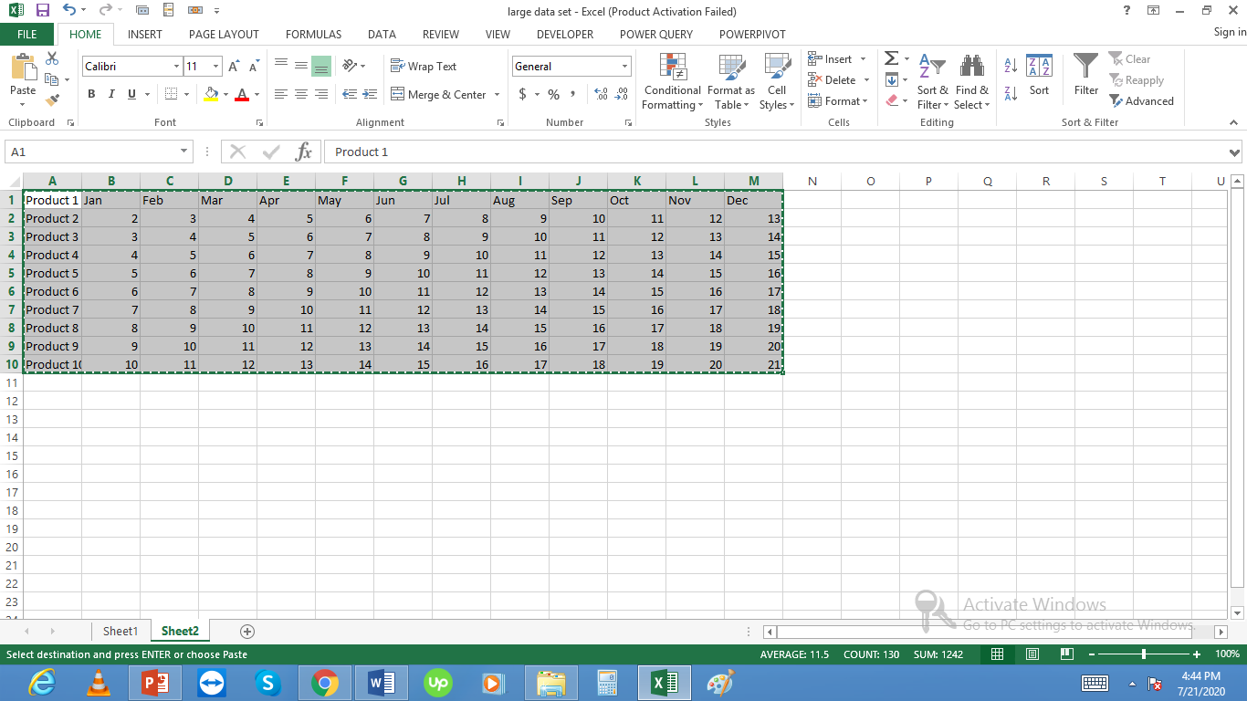
We will create charts with lots of data. We will start with simple chart creation and then move on to more complex charts with large amounts of data in them.
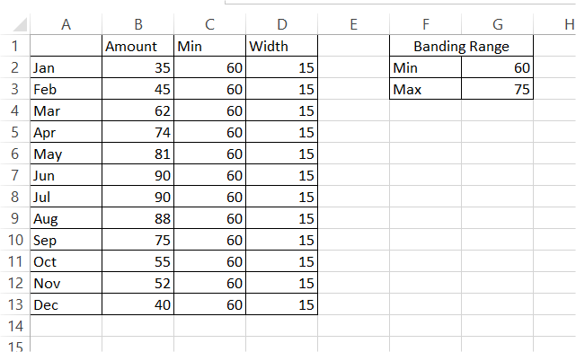
In this Excel tutorial, you will learn how to create a chart with horizontal bands.
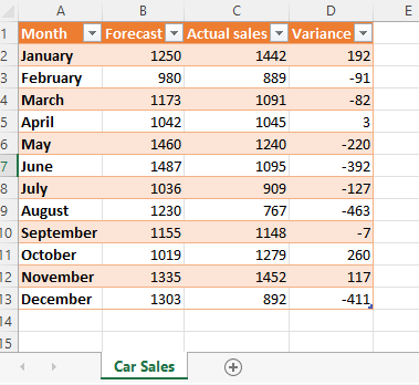
You certainly know how to calculate a variance in Excel. But do you know how to insert variance graphs?
Variance charts in Excel can be used when you wish to compare two sets of data, for example, if you wish to compare the sales forecasts to the actual sales over a period.
Excel does not have a Stiff Diagram chart option in the charts. But, we can create a Stiff Diagram in Excel by using a scatter chart and a freeform diagram in the shapes tool. Tweaking a bit of the coloring of the chart will give us the perfect Stiff Diagram. Here’s how.