How to Create Interactive Charts with Filtered Data and Slicers in Excel
We will learn to create graphs which can be handled by data filters to look more easy and customizable.
Table of Contents
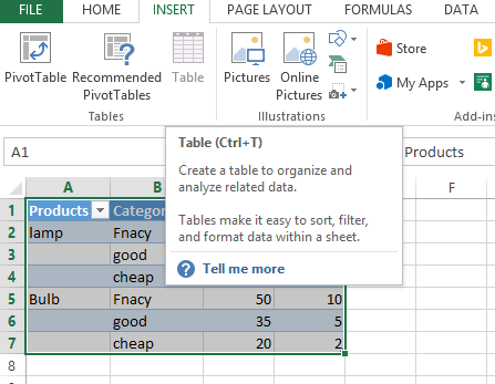
Data preparation
Let us create a chart data for 2 products with different categories.
We have the cost and profit values in this chart. Convert this data to tables to make it more accessible.

The filtered data table with dynamic slicer controls will appear like follows:

The chart
Create a chart from the same now:

The chart will look like this:

Now we can easily filter the category as shown below:

After filtering the graph will look like this:

We can also try to remove a product from the list of products.
Please note that this is a small table but for more number of products and more categories it will be very handy to filter the table and how it reflects on the charts instantly:

The selected product instantly disappeared from the interactive dashboard chart:

We can insert slicer like this also:

This is how slicers look like:

It will very easy to click on the slicer values instead of the filtering:

This approach of linking charts to tables and using slicers is especially powerful for larger datasets and creating interactive dashboards. It allows users to explore the data and visualize different perspectives quickly and easily without needing to manually adjust the chart’s data source.
Please find attached Excel file for reference.


Leave a Reply