How to Create a Chart with an If Statement in Excel
In this Excel charting tutorial, you will learn how to create a chat with if statement. The if condition in Excel is created in the data series. They can be used as checkboxes to change the charts as per the requirements.
In Excel, you can use an if statement to create a chart that dynamically changes based on the value of a cell. This is a useful technique for creating charts that can be customized to show different data sets.
Inserting a chart with if condition
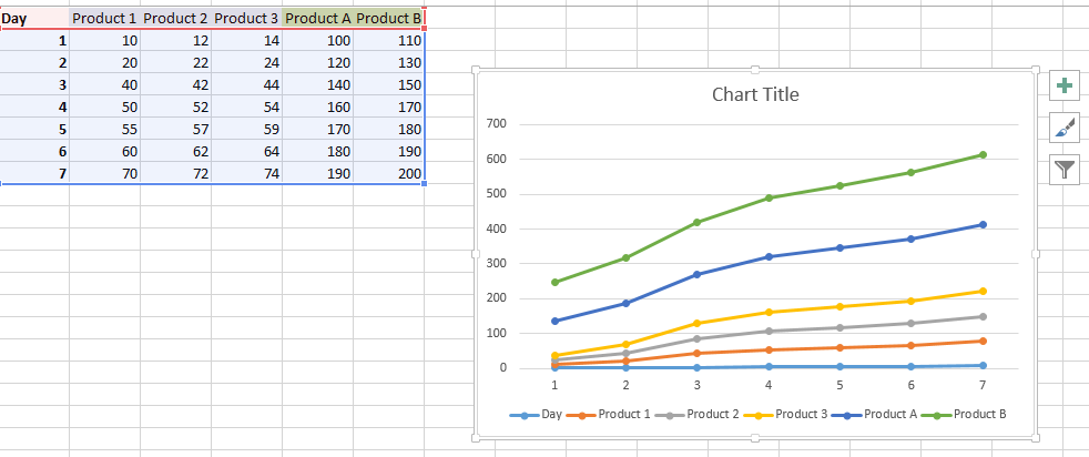
Let us start by creating chart data for the same.
Now we can clearly see that there are two categories of products. Simple if graph looks like this:

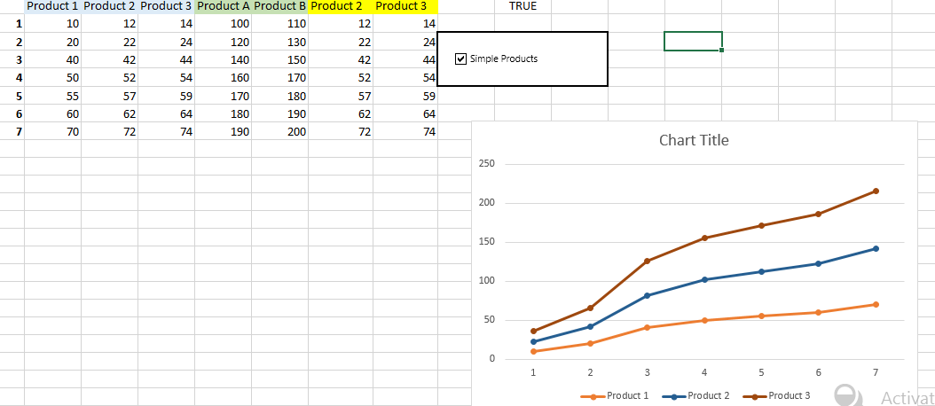
Now you will start by creating the options for the same. You created new columns that have the following formulas: =IF(J1,C1,E1)
The if condition decides if the chart will have column C or E as its series.
So, based on the value in cell J1, it can be product2 or Products A =IF(J1,D1,F1)
The if condition decides if the chart will have column D or F as its series.
Based on the value in cell J1, it can be product3 or Products B.
At this point, you need to know how to insert checkbox in Excel. We have added a checkbox and linked it to the cell j1. In the what-if graph, we have changed the series types, including product1 and the last 2 column products, which can vary.

Finally, create your chart. Select the IF columns as your data source. Now, the chart updates when you click the checkbox.
How does condition work in a what-if chart?
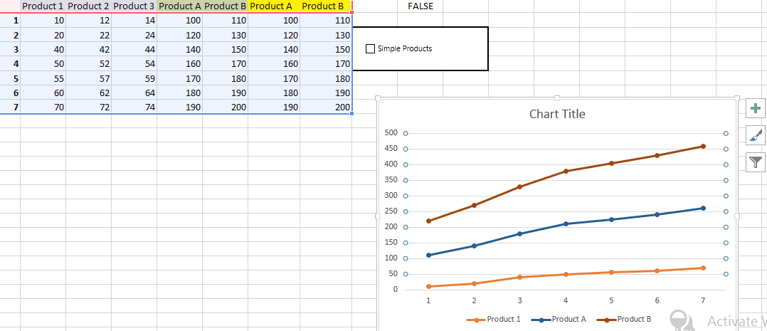
Unchecking the option:

You can add more such checkboxes. You will receive a chart with checkboxes.
Based on such a plot with checkboxes, you can perform a what if analysis in Excel.
You can easily check the same thing in the linked file.


nfey
Nice blog right here!