How to Create a Q-Q Plot in Excel (Step-by-Step Guide)
You will learn how to do mathematical calculations and how to create a Q-Q plot in Excel, also called a probability chart (to be exact, it is a normal distribution probability plot).
Probably, it is the Excel tutorial that solves your issue.
A normal probability plot, also known as a Q-Q plot (quantile-quantile plot), is a graphical tool used to assess whether a set of data is approximately normally distributed. This step-by-step guide shows you how to create a Q-Q plot in Excel efficiently using the following methods:
Data preparation
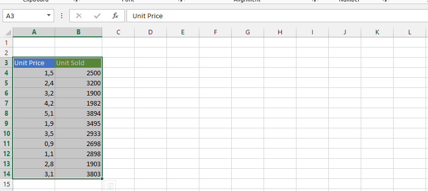
First, you need data that looks like this:

Select the Home tab.

Click on a value in the data and Sort & filter to choose Sort from smallest to largest.

Start another column, with one in between and label it “i”.

Start another column, and label it formula.

Click on D2 and type =(C2-0,375)/(6+0,25).

Double-click on the small square in the right bottom corner of the cell.

Label Column B as the Expected Z.

NORM.S.INV formula
Click on B2 and type =NORM.S.INV(D2).

Double-click on the small square shown in the result from the previous step.

Inserting a normal distribution plot
Highlight A2-B8, click on insert, scatter chart and choose the desired chart to plot the normal distribution chart.

And there’s your probability chart!

Note: You may need to make adjustments to the standard normal values based on the mean and standard deviation of your data. You can do this by using the formula =(A2-MEAN(A:A))/STDEV(A:A), where A2 is the first data point in the sorted data set, and MEAN and STDEV are the functions in Excel that calculate the mean and standard deviation, respectively.


Leave a Reply