Counting occurrences of a character in a spreadsheet
In this Excel tutorial you will teach yourself how to count occurences of a character in a spreadsheet.

Excel Skills Simplified: Tutorials That Actually Work
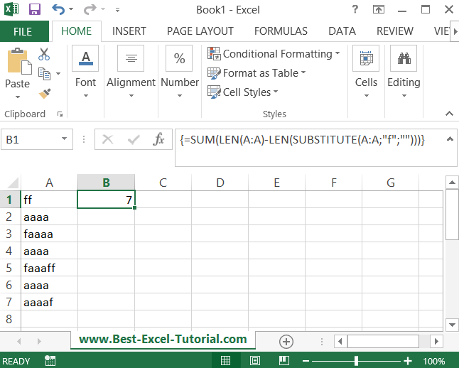
In this Excel tutorial you will teach yourself how to count occurences of a character in a spreadsheet.
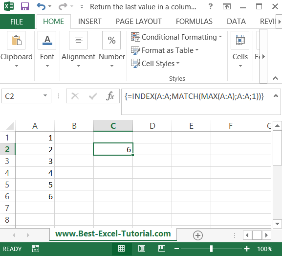
In this Excel tutorial, you will learn how to create a formula which returns the last value in a column.
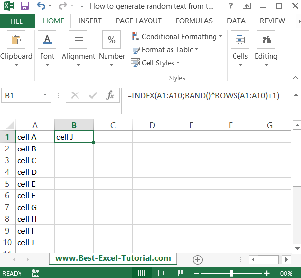
In this Excel tutorial, you learn how to generate random text from a list.
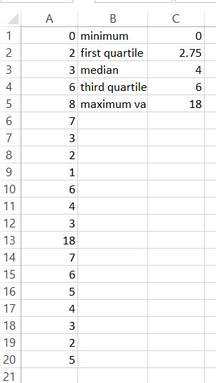
Quartiles are statistical values that divide a sorted data set into four equal parts, with each quartile representing a specific percentile. This Excel tutorial will guide you through calculating quartiles using the QUARTILE.INC function.
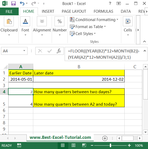
In this Excel tutorial lesson, you will learn how to calculate the count of quarters between two dates using the Excel application.
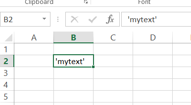
In this Excel lesson, you will teach yourself how to deal with single quote issues.
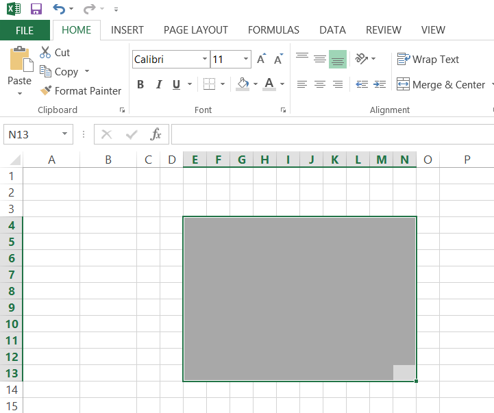
Want to make your data presentations more visually engaging? Waffle Chart is a good choice for Power Point presentations. In this lesson, you learn how to insert a Waffle Chart in Excel.
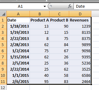
In this Excel charting tutorial lesson, you will create a year-over-year report using a pivot table. You may need that for reports in Excel. Analysts will be especially happy because of that lesson.
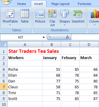
In this Excel charting tutorial lesson, you will learn how to insert a chart with a scrollbar in Excel application. This kind of chart could be useful for more complicated data sets.
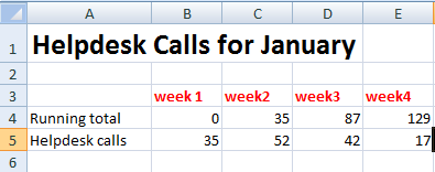
This is quite an interesting kind of chart in this Excel tutorial. Here you learn how to create floating bars and put them into your chart.