How to Calculate CAPM?
The Capital Asset Pricing Model (CAPM) is a financial model that helps to determine the expected return on an investment based on its risk. Here’s how you can calculate CAPM in Microsoft Excel.
Excel Skills Simplified: Tutorials That Actually Work
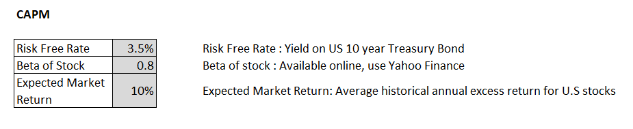
The Capital Asset Pricing Model (CAPM) is a financial model that helps to determine the expected return on an investment based on its risk. Here’s how you can calculate CAPM in Microsoft Excel.
Looping is a fundamental concept in Excel, and it can be done using VBA or macros. However, there are also ways to loop in Excel without using VBA or macros.
We will show you how to loop in Excel using the IF function and the INDEX function.
In this article, we will learn to perform string operations using Excel VBA. A string can be any text or a combination of text and numbers. VBA offers several functions to perform string operations:
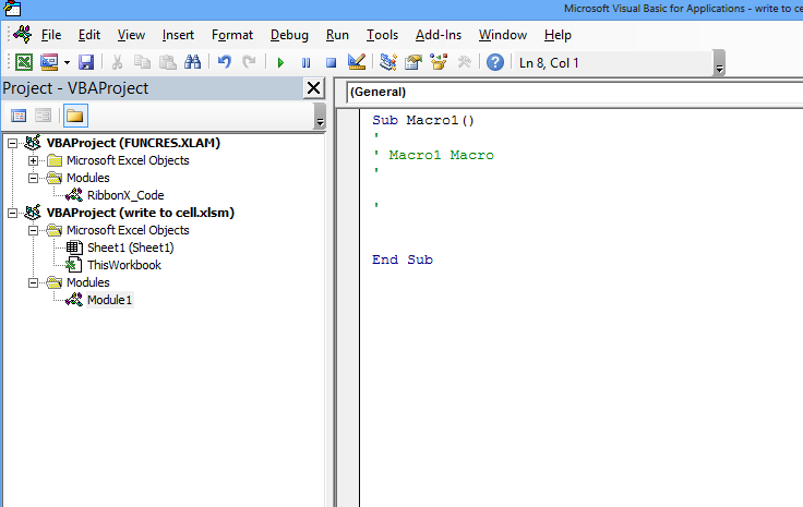
In this Excel tutorial lesson, I will guide you through the basics of Excel VBA and how you can use Excel VBA to write to a cell in an Excel sheet.
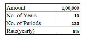
Loan payoffs are simple calculations that are required every time you take a loan from a bank or a financial institution. To prevent yourself from being cheated by others or to be able to help others with their loans, follow the steps below for the loan payoff calculation.
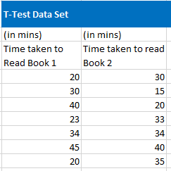
A t-test is a statistical test that helps to determine if there is a significant difference between the means of two sets of data. In MS Excel, we can easily test statistical significance by using the function TTEST. First, take a moment to understand the parameters of this function.
In this Excel tutorial, you learn to create a data entry form in Excel. Data entry forms make it easier to enter and manage data in a structured way. They can help to reduce errors and save time.
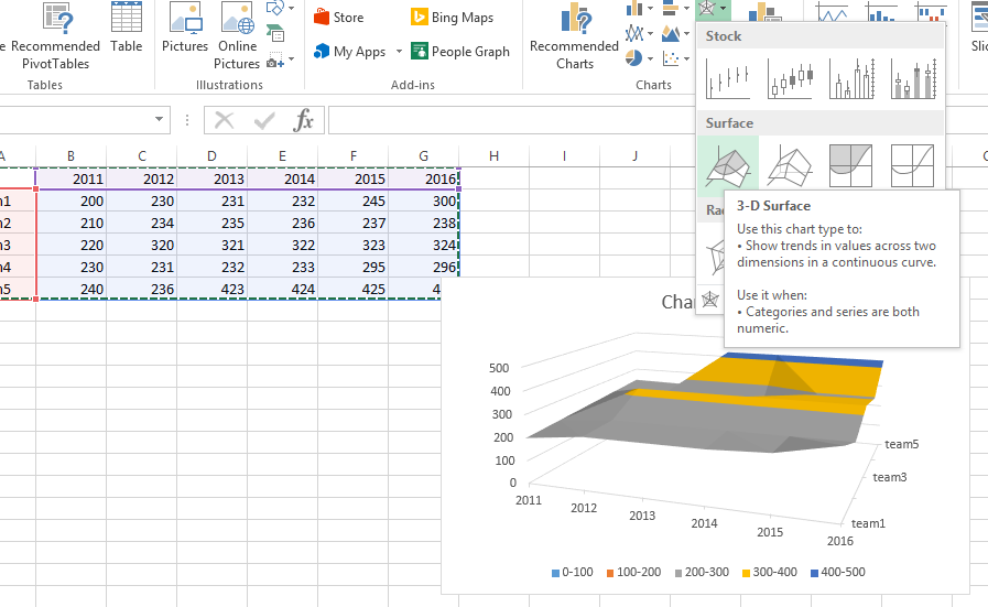
In this Excel tutorial, you will learn about the creation of a wireframe contour chart.

In this Excel tutorial lesson, we will learn how to remove the cell border color in Excel.