How to Make Dynamic Range Chart in Excel
A dynamic range chart in Excel allows the data in the chart to update automatically when the underlying data changes. This is useful when you have a large dataset that is constantly being updated and you want the chart to reflect these changes without having to manually update the chart.
Table of Contents
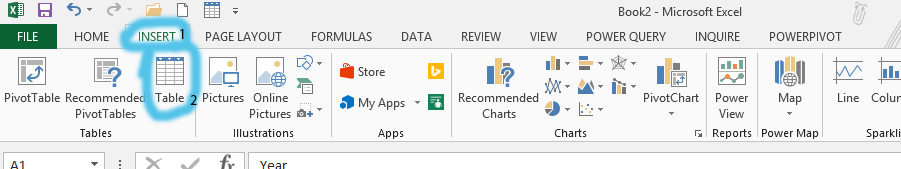
Step 1: Create the Data Table
The simplest way to achieve this is by converting your data into an Excel Table. To do this, select your data range and navigate to the Insert tab, then click Table.

Excel will automatically detect the data range, but you can adjust it if necessary before clicking OK.

Note: If you click on the beginning of the data, it will automatically choose all the range. If it does not, you can change it yourself. Otherwise, just follow the step.
A scatter chart
Once the data is in table format, creating a chart is straightforward. Select any cell within the table, go to the Insert tab, and choose the desired chart type (e.g., a scatter chart).

Because the chart is based on the table, any new data added to the table (either by typing directly below the last row or by pasting data) will automatically be included in the chart’s data source, dynamically updating the chart.

Add new data to the table created in Step 1. The scatter chart will dynamically update to reflect the changes.
You can download free chart template here
For more advanced control over the chart’s dynamic range, especially when dealing with non-contiguous data or when you need to control the number of data points displayed, you can use named ranges in conjunction with the OFFSET and COUNTA functions. For example, if your data is in columns A and B, you could define a named range called ‘MyData’ with the formula =OFFSET(Sheet1!$A$1,0,0,COUNTA(Sheet1!$A:$A),2).
This formula creates a dynamic range that starts at A1 and expands downwards to include all rows containing data in column A, spanning two columns (A and B). You would then set the chart’s data source to this named range.


Leave a Reply