How to Make a Chart for Large Data Set
We will create charts with lots of data. We will start with simple chart creation and then move on to more complex charts with large amounts of data in them.
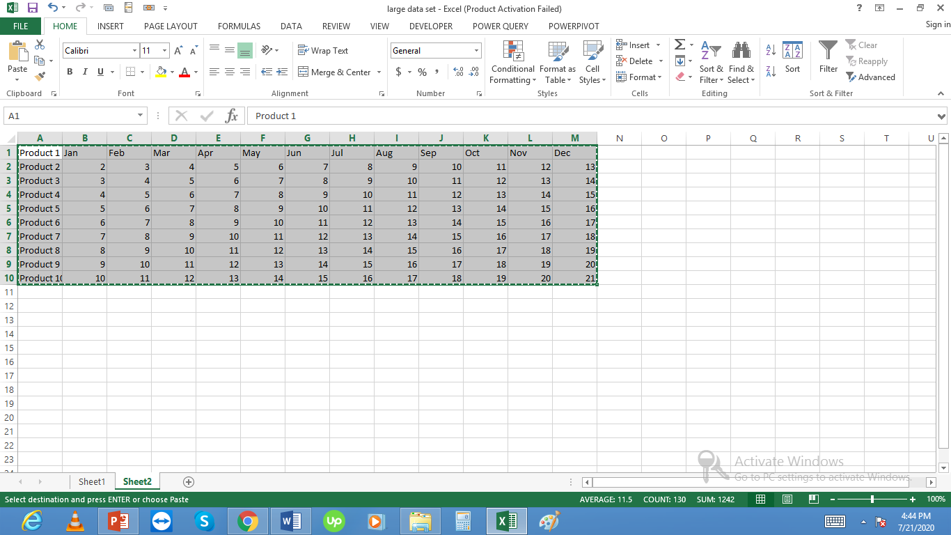
Large data set preparation
Start by preparing your data in a well-organized format. Ensure that your data is clean, properly labeled, and structured with clear headers.

Inserting a chart with a lot of data
Create a chart for these 10 products. Select your data range including headers. Go to the Insert menu and choose a 2D Column Chart (or your preferred chart type).

When the number of data points increases significantly the chart becomes cluttered and difficult to read. The visualization loses its effectiveness as the individual data points compress into an unreadable mass of overlapping elements.

Switch Rows and Columns
First, switch rows and columns in the chart:

Check the results to see if the chart becomes more understandable and professional-looking.

Creating quarterly charts
Instead of displaying every individual data point, aggregate your data into larger intervals. Rather than showing all 12 months, create quarterly charts that combine data from three months into a single point.

Experiment with removing less critical data points or grouping similar categories together to create a cleaner, more focused visualization.


Debaki Sapkota
thanks