How to Use List Box Control in Excel Vba
A List Box control in Excel VBA allows you to display a list of items in a box on a user form and let the user select one or more items from the list. Here’s how to use a List Box control in Excel VBA:
Excel Skills Simplified: Tutorials That Actually Work
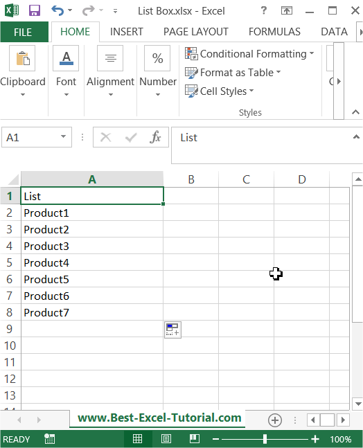
A List Box control in Excel VBA allows you to display a list of items in a box on a user form and let the user select one or more items from the list. Here’s how to use a List Box control in Excel VBA:
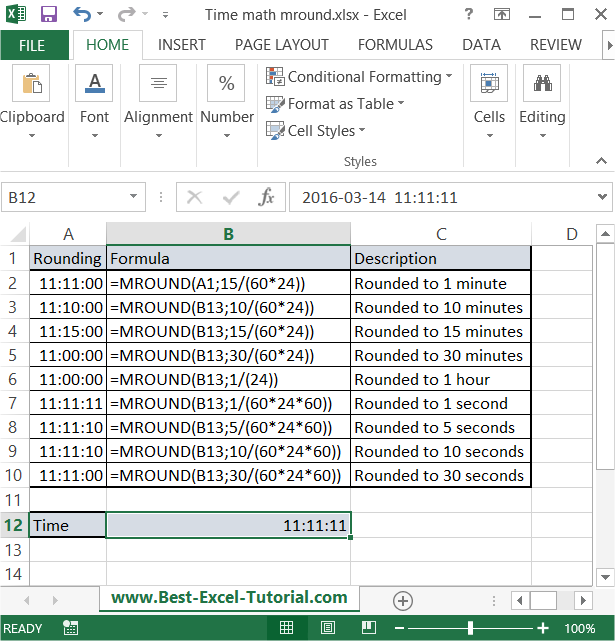
In this Excel tutorial, you will learn yourself how to round to nearest time. This kind of time math is particularly useful in spreadsheets where you deal with tracking time, such as for scheduling or payroll.
Using the right-click mouse button in Excel can significantly streamline your workflow by providing quick access to various commands and options. Below, discover key right-click mouse tips to optimize your Excel skills.
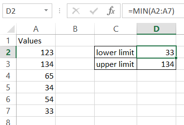
In this Excel tutorial, you will learn how to create a chart with upper and lower control limits. It is ideal for Six Sigma style quality control dashboards.
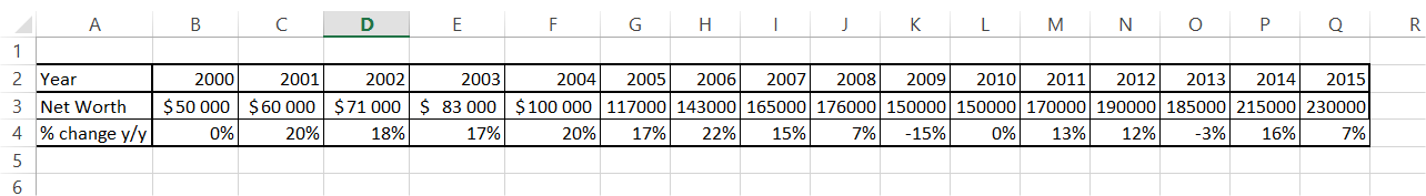
In this Excel charting tutorial leasson, you will learn how to create a chart with number and percentage. You will need it to show both numbers and part of a whole or change using percentage.
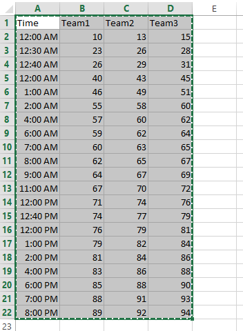
In this Excel charting tutorial lesson, you will learn how to create an Excel chart with hours in the best way possible.
We will learn to create graphs which can be handled by data filters to look more easy and customizable.
In this article, we will try to learn the method for creating charts with confidence interval in Excel.
In Microsoft Excel, you can add an average line to a chart to show the average value for the data in your chart. In this Excel tutorial, you will learn how to create a chart with an average line.