How to Create a Time Series Chart with Hours in Excel
In this Excel charting tutorial lesson, you will learn how to create an Excel chart with hours in the best way possible.
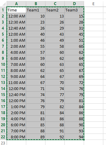
Preparing data for chart with time
Start with the creation data for the hour by hour chart, which will have data flowing with hours.

Creating a chart with hours
Now, let’s start creating an XY scatter chart for time series visualization. In the Charts group, select Scatter with Smooth Lines and Markers.

Your completed XY scatter plot with time series data will display time intervals along the x-axis and corresponding values on the y-axis like this:

Make sure the Axis Type is set to Time Axis. When you are creating a line chart, column graph or bar chart, Excel will automatically treat date data as a “Date axis”. This means that each data point will be plotted on the x-axis based on linear time, rather than an equal distance from each other.

Right-click on the x-axis (where hours are displayed) and choose Format Axis. In the Format Axis pane, under Axis Options, set the Category to Time. This ensures that Excel treats the time values as continuous data, not just text, and plots them in proportion.
You can also format the chart by changing the font size, adding gridlines, labels, title, adjusting the color scheme and other formatting options.
You should now have a chart that displays data over time, with hours plotted on the x-axis and your data points on the y-axis. The chart will visually show how values change throughout the day.


Leave a Reply