How to use Sparklines in Excel
In this tutorial, you’ll discover how to effectively utilize Sparklines, which are compact charts designed for trend identification within cells. Sparklines offer a quick overview of data trends, perfect for dashboards, reports, and spreadsheets.
Creating Sparklines
To create a sparkline, click anywhere in the data area. Then go to the Insert > Sparklines and select the desired type.

A Create Sparklines window appears.
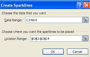
Specify the data range by clicking inside the Data Range textbox and selecting cells.
In the Location Range textbox, identify where you want to insert the sparkline.
Utilize AutoComplete for additional cells or create multiple sparklines for multiple rows.
Types of Sparklines
There are three primary types of Sparklines in Excel:
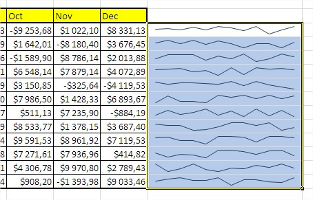
Line Spaklines
This type of sparkline represent trends in data over time and are ideal for continuous data sets. Line Sparklines display a series of data points as a simple line, with the height of the line indicating the data value.
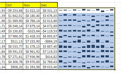
Column Spaklines
Similar to bar charts, Column Sparklines are used to represent categorical data. They display a series of columns, with the height of each column representing the data value.
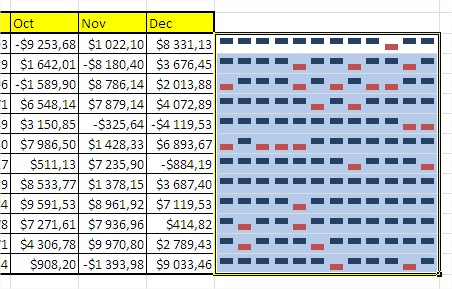
Win / Loss Spaklines
Designed for data sets with only two values (e.g., win/loss results or binary data), Win/Loss Sparklines display a series of small dots. Positive values are shown as dots above the line, while negative values appear below the line.
Highlighting Specific Points
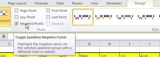
You can enhance the clarity of your Sparklines by highlighting specific data points, such as positive or negative values. Use the “Show” group on the “Design” tab to access options for displaying markers, high points, low points, and the first and last points.
For instance, to highlight negative values in a Sparkline, select the “Negative Points” checkbox.
Customizing Sparklines
Tailor your Sparklines to match your preferences by adjusting their color, style, and size. The “Sparkline Options” group on the “Design” tab provides options for changing marker color, line color, fill color, and border style.
You can also modify the Sparkline’s size by dragging the sizing handles.

Removing Sparklines
To remove sparklines, simply selecting the cells containing them and pressing the Delete key will not work. Instead, select the cells with the sparklines, right-click, and choose ‘Sparklines’ followed by ‘Clear Selected Sparklines’.
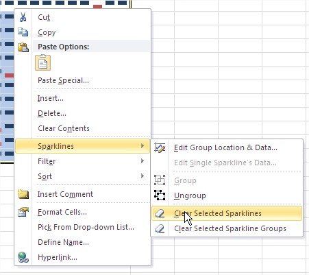
Alternatively, you can achieve the same result by selecting the sparklines, which will reveal the ‘Sparkline Tools Design’ tab on the ribbon. Within the ‘Group’ section of this ‘Design’ tab, you’ll find the ‘Clear’ option.

The location range for Sparklines specifies where the Sparklines will be inserted. You can define the location range when creating Sparklines or modify it afterward.




Leave a Reply