Time Series Graph
Learn how to create a time series graph in Excel to visualize quarterly reports and timeline data. This comprehensive tutorial teaches you how to insert time series graphs and charts, organize periodic data with equal time intervals, and build professional time series visualizations for data analysis and reporting.
Table of Contents
How to Prepare Time Series Data for Excel Charts and Graphs
In the case of time series plot, the key thing is to properly prepare the data. In order for the time series chart to be properly prepared, you need data that contain an equal time interval.
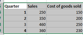
In my case, the data includes sales and cost of goods sold for quarters.
To start creating a times period graph, select your data table.

Creating a Time Series Chart in Excel: Complete Step-by-Step Instructions
Then go to Insert > Scatter > Scatter with Smooth Lines. You will get a chart like this:

Edit horizontal axis. To edit the horizontal axis, right-click the horizontal and go to Format Axis. A tab will appear on the right.

Under axis options, change the maximum to 4 and the major (under units sections) to 1.

Delete the horizontal gridlines. Your final graph will look like this.

I only presented a simple timing chart, but hopefully you found out how to fix your problem.


Leave a Reply