How to Add Multiple Trendlines in Excel
Creating a chart with two trendlines has different things in common.
Excel Skills Simplified: Tutorials That Actually Work
Creating a chart with two trendlines has different things in common.
Showing the yes/no value in the Pivot Table has multiple steps to it. See how to do that in Excel.
Win-loss data analysis in Excel can be done using the Quick Analysis tool, which is a feature that allows you to quickly analyze and visualize data in your worksheet. Here’s how to perform win-loss data analysis using Quick Analysis:
In this Excel charting tutorial, you will learn how to add a horizontal line to a graph. Inserting a horizontal line into a chart is very possible.
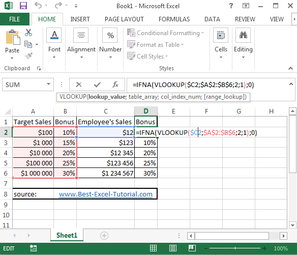
Vlookup is a powerful function in Excel that can be used to search for a specific value in a range of cells and return a corresponding value from a different column in the same row. Doing vlookup for a range of values is also possible.
Here you have an example which shows you how to deal with vlookup for a range in Excel.
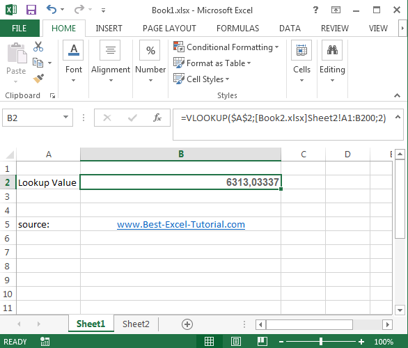
The VLOOKUP function is one of Excel’s most popular tools for retrieving data from tables. While it typically works within a single table or sheet, there are ways to extend its capabilities to lookup values across multiple files.
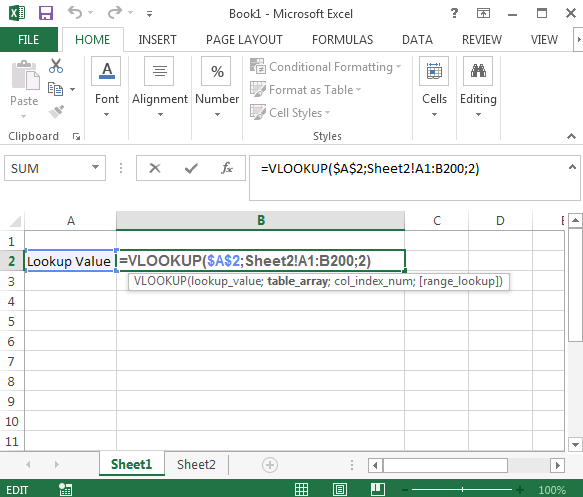
When working with data spread across multiple sheets in Excel, you might need to use the VLOOKUP function to retrieve information from these various sheets. In this lesson you will learn how to do vlookup in this case.
In this Excel tutorial, you learn how to calculate an enthalpy change in Excel spreadsheet.
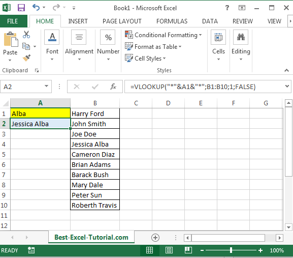
In this Excel tutorial, you learn how to vlookup using string of text. This is a simple trick you will understand and use many times in Excel.
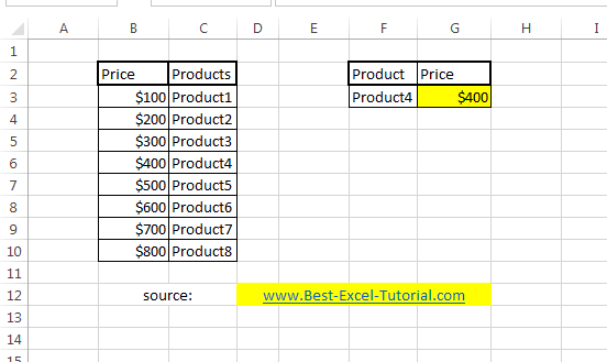
Something tricky today. Let’s create some backwards VLOOKUP formula. It’s quite easy, but not obvious. Here’s an example.