How to Make Ranking Bump Chart

A bump chart is a type of chart that can be created in Excel. We are going to insert a ranking bump chart. I am using Microsoft Excel 2013, but you can use other versions to perform the insertion.

Rank charts are not often used in Excel. Due to their specificity, they are not suitable for most applications. However, the bump graph is a good choice to show:

  • ranking changes over time
  • results of changes in election polls
  • position changes in the table, e.g. football teams in the league

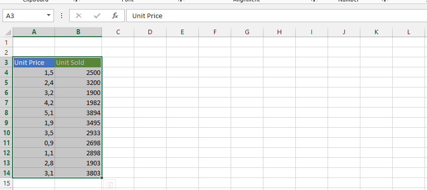
Prior to inserting the bump chart, I will assume that you have data available, which is something like this:

data set to create a bump chart in Excel

Note: The data can be as you like, it is about ranking the products or anything else, and you can place any data you want.

How to create a Bump Chart?

Copy the time and whatever you would like to rank in a new place on the same sheet. In this case, we are going with products.

click cell of rank chart

Mark the same quantities of cells with data as in the data you initially had.

data quantities for bump chart

Use the rank function to rank the columns.

The rank function syntax is:

=RANK(number, rank, [order])

Rank function arguments:

  • number – the value for which you want to find the ranking
  • rank – The range of values for which you are looking for a ranking
  • order – an optional parameter needed when you want to decide whether the ranking should be sorted in ascending or descending order
See also  Difference chart

With the marked area, click on the formula bar, and type in =RANK(B2; all the cells in the same column, for example B$2:B$5). The full formula in my example is =RANK(B2,B$2:B$5,0). Press CTRL + Enter.

rank function

Click on any of the rank cells that are still marked.

copy rank

Click on the insert tab (1), and then click on the Line chart (2).

insert line chart

Choose a line chart without a marker in 2-D.

chart without marker

Right-click on the Y axis (1), and click on the format axis (2).

format axis of bump chart

In the bound, type 0 as the minimum (1), 4 as the maximum (2), 0 as the minor (3), 1 as the major (4), and then check values in reverse order (5).

bounds of bump chart

Note: If you have three different things you are ranking rather than four, you should set the maximum (2) to 3. You can also add an axis title if you wish.

Our Bump Chart:

bump chart example

Advanced Techniques for Creating Bump Charts

We will discuss some advanced techniques for creating bump charts. These techniques can be used to create more visually appealing and informative bump charts.

One technique is to use different colors for each line in the bump chart. This can help to make the chart easier to read and understand. For example, you could use different colors to represent different products, different time periods, or different data sets.

Another technique is to use different line styles for each line in the bump chart. This can also help to make the chart easier to read and understand. For example, you could use solid lines for positive changes, dashed lines for negative changes, and dotted lines for neutral changes.

See also  How to Create a Floating Chart

You can also use different shapes for the markers on the bump chart. This can help to add visual interest to the chart. For example, you could use circles, squares, triangles, or diamonds for the markers.

Finally, you can use different formatting options to customize the appearance of the bump chart. For example, you can change the font, size, and color of the text, and you can change the width and style of the lines.

By using these advanced techniques, you can create bump charts that are more visually appealing and informative. This can help you to communicate your data more effectively and to reach a wider audience.

Here are some additional tips for creating effective bump charts:

  • Use a consistent color scheme throughout the chart.
  • Make sure the text is easy to read and understand.
  • Use a clear and concise title for the chart.
  • Label the axes of the chart clearly.
  • Use a legend to explain the different lines or shapes in the chart.
  • Optimize the chart for the screen or print medium you are using.

By following these tips, you can create bump charts that are both informative and visually appealing.

Key Takeaways

  • A bump chart is a type of chart that can be used to visualize ranking changes over time.
  • Bump charts can be created in Excel using the RANK function.
  • To create a bump chart, you need to select the data for the chart, create a line chart, and then format the chart to remove the markers.
  • You can use advanced techniques to create more visually appealing and informative bump charts.
See also  How to make 3 axis graph

FAQ

  • Q: What is the difference between a bump chart and a line chart?
  • A: A line chart shows the change in values over time, while a bump chart shows the ranking of values over time.
  • Q: Can I create a bump chart in other software besides Excel?
  • A: Yes, you can create a bump chart in other software, such as Google Sheets and PowerPoint.
  • Q: What are some other uses for bump charts?
  • A: Bump charts can be used to visualize ranking changes in election polls, sports standings, and stock prices.

You can download a free Bump chart template here