How to do the win loss data analysis using Quick Analysis?
Win-loss data analysis in Excel can be done using the Quick Analysis tool, which is a feature that allows you to quickly analyze and visualize data in your worksheet. Here’s how to perform win-loss data analysis using Quick Analysis:
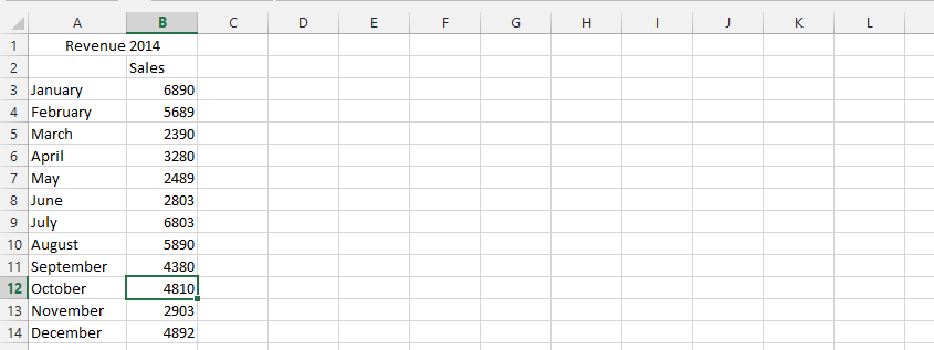
Data Preparation
Have your data prepared in a worksheet. This typically involves a list of values or numbers representing wins and losses.

Conditional Formatting
- Select the range of data you want to analyze.
- Click on the small Quick Analysis icon that appears at the bottom-right corner of the selected data range.
- Choose the “Greater Than” option from the menu that appears.
- Enter the threshold value (e.g., the value that represents a win).

Calculating Total
Calculating totals using the SUM function provides a summary of wins and losses for each category or period.
- Add a row at the bottom (or top) of your data and label it as “Total”.
- Use the SUM function to calculate the total wins (or losses) in the corresponding column.
- Drag the formula across all relevant columns to calculate totals for each category.

Creating Sparklines
- Select the range of data, including the “Total” row.
- Click on the small Quick Analysis icon that appears at the bottom-right corner of the selected data range.
- Choose the “Sparklines” option from the menu.
- Select “Win/Loss” to create sparklines based on your data.
- Customize the display options for sparklines as needed, such as highlighting positive and negative values.

Visualization
The sparklines will provide a visual representation of your win-loss data, making it easier to identify trends and patterns.
Positive values may be displayed in one color (e.g., green) to represent wins, while negative values may be displayed in another color (e.g., red) to represent losses.

For a more quantitative analysis, you can calculate win/loss ratios or win percentages. For example, if cell E16 contains the total wins and cell F16 contains the total losses for a given category, the win percentage can be calculated using the formula =E16/(E16+F16) and then formatted as a percentage. This provides a more precise metric for comparing performance across different categories or periods.
Using Quick Analysis in Excel simplifies the process of creating visualizations like sparklines, which can help you quickly assess and interpret your data.


Leave a Reply