Chart with multiple series
Learn how to create a chart with multiple series in Excel to compare and visualize multiple datasets on the same chart. This comprehensive tutorial teaches you how to create multi-series charts, organize data effectively, and display multiple series side by side for better data analysis and comparison.
How to Create a Chart with Multiple Series in Excel: Step-by-Step Instructions
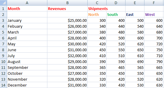
Consider the data sets with multiple data series. Organize your data into columns, with each column representing a set of values that you want to display in the chart. Make sure that the data is organized in a way that makes sense for the type of chart you want to create.

Inserting a chart with multiple data sets
Highlight data. Go to the ribbon. Under the Insert option, select the Scatter chart with lines option.

Now you will have the chart window as shown below.

As you can see, all lines clotted in one place in the final step. To separate them, right-click on any line and select the Format Data Series option.

Adding Secondary Axis to Your Multi-Series Excel Chart
A window will appear like the one shown below. Select the Secondary Axis.

Now repeat for all the lines of data (if needed).

To set the axis of the chart, select the right side scale, right-click and select Format Axis as shown below.

Now a window will appear like shown below. In the Axis Option set the Maximum scale according to the highest value of your data.

You can format the chart to make it look the way you want, including changing the colors, adding labels, and customizing the axis. To format the chart, select it and go to the “Design” tab in the ribbon. Use the options in the “Chart Styles” and “Chart Layouts” groups to change the look of the chart.
Here you go with the chart with multiple series.

The chart will display the values for each series side by side, allowing you to compare the values and draw conclusions from the data.


Leave a Reply