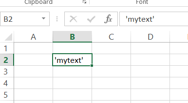
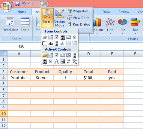
How to display a single quote in a cell?
In this Excel lesson, you will teach yourself how to deal with single quote issues.
Excel Skills Simplified: Tutorials That Actually Work
In this Excel lesson, you will teach yourself how to deal with single quote issues.
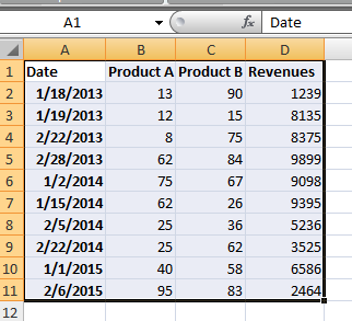
In this Excel charting tutorial lesson, you will create a year-over-year report using a pivot table. You may need that for reports in Excel. Analysts will be especially happy because of that lesson.
In this lesson, you will teach yourself how to do counting only distinct values in pivot table. Do you think it is difficult? You will be suprised.
In this Excel tutorial, you will learn how to add an average column to your pivot table. This is a very useful and simple trick for calculating averages in Excel and making your data analysis more effective.
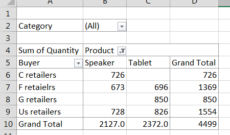
In this lesson, you will learn how to display pivot table data as percentage of total. To display data as a percentage of the total in a pivot table, you can use the “Show Values As” feature in Microsoft Excel. It is really easy and it might be helpful for you.
In this lesson, you will learn how to modify a calculated field in your pivot table to make the necessary calculations for your data analysis needs.
In this Excel tutorial, you learn how to refresh pivot table with new data. You need this to analyze the data after the update.
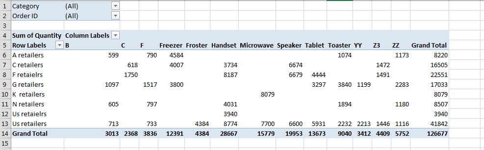
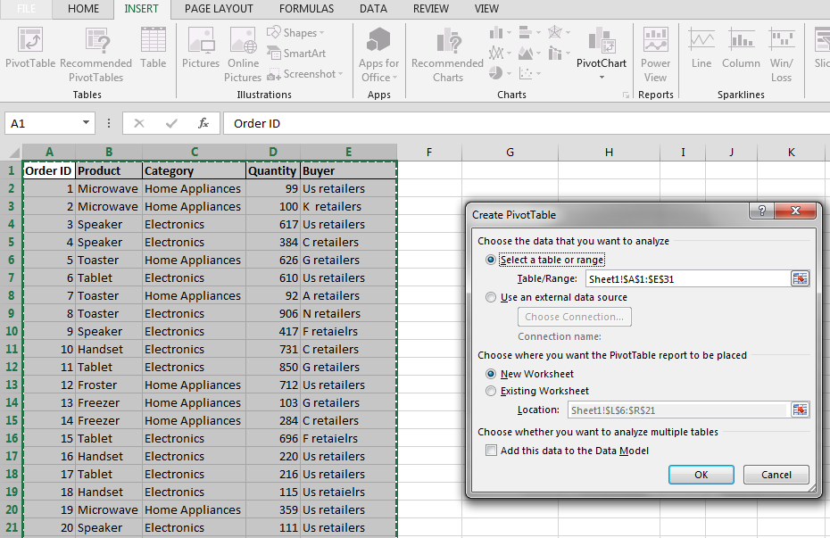
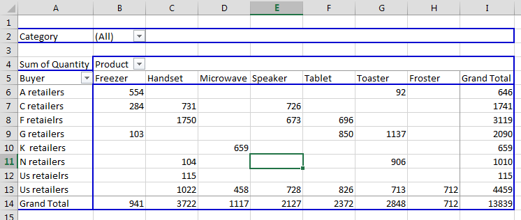
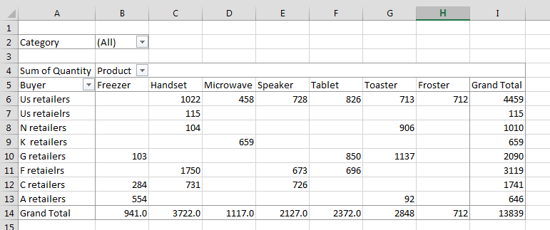
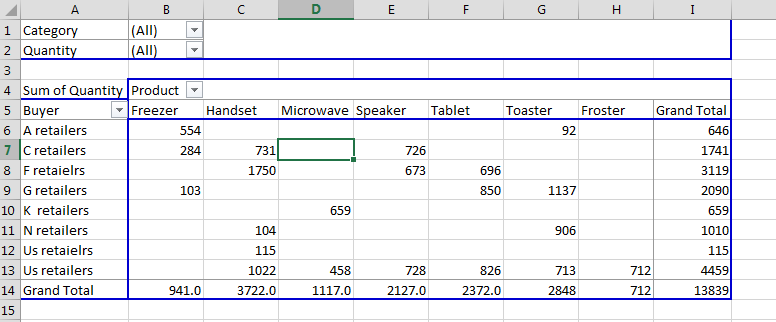
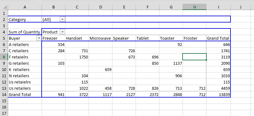
Pivot tables are a powerful tool in Excel that can be used to summarize and analyze data. One of the features of pivot tables is the ability to filter the data. This can be useful for finding the top 10 values in a particular field.
We will show you how to filter the top 10 values in a pivot table in Excel.