How to Create Stock Chart in Excel
In this Excel charting tutorial, you will learn how to make a stock chart in Excel. You can use such a graph everytime you have open, high, low, close data values.
Excel Skills Simplified: Tutorials That Actually Work
In this Excel charting tutorial, you will learn how to make a stock chart in Excel. You can use such a graph everytime you have open, high, low, close data values.
It is a pity that the ogive chart is not a defined chart type in Excel. I sometimes use it and for this reason I have to do an ogive graph step by step. Below I will show you how to easily create an ogive chart in Excel.
There is simplicity in breaking the column of a chart, and we are going to justify this simplicity. Follow along as I demonstrate how to break one column in Excel.
Creating an interactive dashboard in Excel can help you communicate complex data insights in a visually appealing and accessible way. An interactive dashboard allows you to present data from multiple sources, including charts, tables, and pivot tables, and provides users with a way to interact with the data to gain insights and make informed decisions. Follow this steps below to create an interactive dashboard.
An SPC (Statistical Process Control) control chart is a graphical representation of process data over time, used to detect any potential out-of-control conditions or assignable causes of variation in a process. In this lesson, you will learn how to create a statistical process control chart.
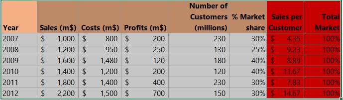
We are going to learn how to read values from graphs. There are two ways to do this: using the Manipulate Points On Chart add-in or adding data labels to the graph.
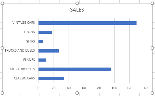
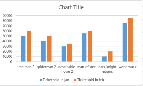
Every Excel tutorial needs to contain how to make a bar chart lesson. Bar charts are one of the simplest ways to represent a collection of data. Also, creating a bar chart is just a matter of a few clicks in Excel.
This is an ultimate guide to cover up creating and formatting bar charts, types of bar charts and its limitations.
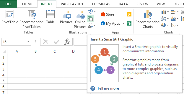
Venn diagrams are powerful tools for visualizing relationships and overlaps in your data. Excel makes it surprisingly easy to create them! Follow the steps below to create a Venn Diagram.
To demonstrate how to create a bridge chart, we are going to use dummy data. The bridge chart will show the individual components of the profit and loss. Complete the process to create a professional bridge chart by following these step-by-step instructions.