How to Make a Bridge Chart in Excel
To demonstrate how to create a bridge chart, we are going to use dummy data. The bridge chart will show the individual components of the profit and loss. Complete the process to create a professional bridge chart by following these step-by-step instructions.
What is Bridge Chart?
A bridge chart, also known as a waterfall chart, visually represents the cumulative effect of sequential positive and negative values, showing how an initial value is transformed into a final value.
This chart type is particularly useful for explaining changes in financial metrics like profit/loss, revenue, or budget variances, clearly illustrating the contributions of each component to the overall change.
How to insert Bridge Chart?
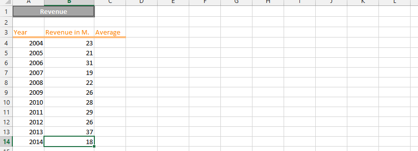
Begin by entering your dummy data values into your Excel spreadsheet, ensuring your dataset includes categories in column A and corresponding numerical values in column B for the bridge chart.

Now you have to create a stack flow chart. To do this, click on the “INSERT” tab, then click on “Insert column chart” under the Charts group. Click on and select the Stack Column chart type from the available column chart options. Select the Stack Column.

A chart has been created, but it doesn’t look like a bridge graph. To change this, right-click on any one of the blue columns (Excel will select all of the blue ones) and select “Format Data Series”. A dialog box appears, where you should select “No fill”.

To make it look like a bridge chart in the same dialog box, in the “Series Options” tick “Gap Width” 0% (“No Gap”).

For an even more attractive graph format, the columns of revenue and profits can be set to fill in blue. Blue color for profits and red color for losses makes your chart easier to read. Better visualization will make your chart better for the person who will use that.

Your Bridge Chart should now clearly display the flow of your data, with increases and decreases contributing to the final total.

The key to creating a proper bridge chart lies in how the data is structured. The first value represents the starting point, subsequent values represent the changes (increases or decreases), and the final value represents the end point.
The intermediate values are used to create the “floating” segments of the chart, visually bridging the gap between the start and end points. These floating segments are what are formatted with “No Fill” to create the bridge effect.


Leave a Reply