How to Change Markers on Excel Graph
Learn how to change markers on Excel graphs with this comprehensive step-by-step tutorial. Discover how to customize marker colors, shapes, and styles to highlight specific data points and enhance your chart presentation. This guide covers all methods to change Excel markers, from basic color modifications to advanced formatting techniques.
How to Prepare Your Excel Chart Data for Marker Customization
In Microsoft Excel, markers are symbols used to identify individual data points on a graph. To change the markers on a graph in Excel, follow these steps:
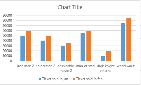
Consider the data set with a chart window.

Right-click on the marker to bring up a dropdown menu. Then select the Format Data Series option.

A pane will appear, allowing you to customize the appearance of the markers.

Changing Marker Colors and Styles in Your Excel Charts
From the left side, select Marker Fill and then Solid Fill from the color palette. Select the new color of the marker.

You can choose from a variety of marker shapes, such as squares, diamonds, or circles.
If desired, you can format the markers by right-clicking on the markers and choosing Format Data Point from the context menu. You can adjust the size, color, and border of the markers.
Now, here you go with the new color of your marker.

Advanced Marker Customization Using Excel Formulas and Conditional Formatting
For more advanced customization, you can use formulas to dynamically control marker colors based on data values. This involves creating a helper column with formulas that return different values based on criteria.
Then, you can use conditional formatting with color scales or icon sets based on the helper column.
For example, the formula =IF(A2>10, 3, IF(A2>5, 2, 1)) in a helper column would assign 3, 2, or 1 based on the value in A2, which you could then use to apply different marker colors through conditional formatting.
To apply the conditional formatting, select the data series in your chart, go to Format Data Series > Fill & Line > Marker > Marker Options > Fill > Gradient fill. Under Gradient stops, you can then set different colors based on the numerical values in your helper column, effectively creating dynamic marker coloring.


Leave a Reply