How to Make Gauss Normal Distribution Chart
In this Excel tutorial, you will learn what a gauss chart is and how to insert it. The chart is also known as a normal distribution chart or a bell curve.
This chart represents the probability distribution of a dataset and is named after the German mathematician Johann Gauss. Known as the “Prince of Mathematicians”, Gauss developed a function that allows for the drawing of a bell curve. Today, anyone can create a chart on their own and become the prince of Excel.

The normal distribution, also called the Laplace-Gaussian distribution is one of the most important probability distributions. It plays an important role in the statistical description of the issues of natural, industrial, medical, social, etc.
The reason is its prevalence in nature. If a size is the sum or average of a large number of small random factors, regardless of the distribution of each of these factors, the distribution will be close to normal, so it can be very often seen in the data.
In addition, the normal distribution has some interesting mathematical properties that make it based on statistical methods computationally simple.
Preparing data for a Gauss chart in Excel
In addition to the mean and standard deviation which are the two basic parameters that describe the normal distribution we need more bands, which allow you to move the desired graph on the horizontal axis. We create two sets of artificial: Series 1 contains the number rising by 0.25 (from -5 to 5), and Series 2 = Series 1 * standard deviation + average

Then, in the third column, insert the NORMDIST function, using data from the second series.

Inserting a Gauss chart in Excel
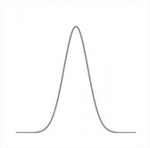
With so prepared data Select the columns and Series 2 and insert the normal distribution scatter plot with smooth lines. We obtain the following graph.

After a small correction is made, the beautiful shape of a bell is obtained. You will have a visually appealing bell curve that represents the normal distribution of your data.

Now, changing our input parameters – mean and standard deviation – we can see changes immediately in the chart. Interestingly, the normal distribution perfectly describes the intelligence, height, or intensity of the light source.
Experiment with your data to create a Gauss (normal distribution) chart in Excel.
Free spreadsheet to download to see hands-on how altering mean and standard deviation reshapes the bell curve


Leave a Reply