Chart with a single x-axis but two different ranges
In this charting tutorial, you will learn how to create an Excel chart with multiple ranges on a single x-axis to display multiple data series with different value ranges.
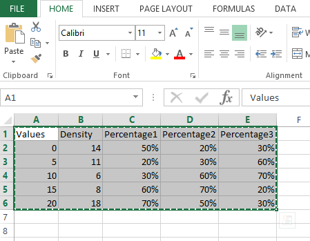
Let us create a simple chart having 2 types of data like day density (range 0 to 20) and percentages (0 to 100%) like below:

Changing x axis range
Create a simple graph. A simple 2d column chart will look like this:

The issue with this chart is that the percentages are treated as decimals and have very low values r columns displayed which are not visible at all.
Let us handle it by creating the secondary axis as follows. Right-click on the graph and click change chart type:

Adding secondary axis range
Select “Combo” chart type. Check secondary axis for percentages:

Right-click the axis on the right and click format axis:

In the axis options change the min and max to 0 to 1.0

And then change the number format to percentages as follows:

Change the number format to “Percentage” for the secondary axis.

Finally we will have 2 types of axis and the graph looks readable for both Density and percentages:

You now have a chart in Microsoft Excel with a single x-axis but two different ranges.


Leave a Reply