How to Create a Chart with Arrows in Excel: Step-by-Step Guide
In this charting tutorial, we will create the Excel chart with arrows. To create a chart with arrows in Excel, you can use a combination of the built-in chart types and custom shapes.
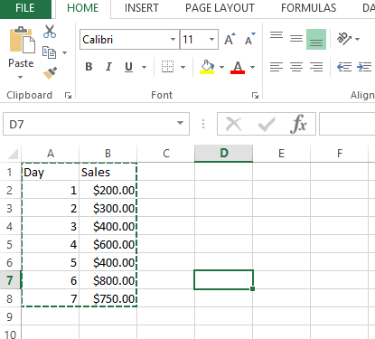
We must start with creating some sales data and then we will create a simple chart from the same.
Please find below the sales data for 7 days of a week for a company. It will look like this is an Excel spreadsheet:

Now, we will create a simple bar chart from the Excel file as shown below. Select the entire data:

From the Insert tab from Excel, select insert > column chart:

To create a chart with arrows in Excel, select the 2d column chart option:

When preparing your chart with arrows in Excel, unselect the Day row from your selected data:

Chart will look like this now:

Adding arrows in Excel
Now, we will have to convert these columns to arrows. Insert > shapes > arrow:

Drag the space on Excel to draw arrow:
![]()
Inserting arrows in chart
After selecting the arrow press ctrl + c to copy the arrow. Then select all the bars in the chart:

After selection, just type ctrl + v to paste all the shapes to the bars of the chart, and then it will look like the below arrow chart.
![]()
Then we can remove the extra arrow.
Note: You can also use other shapes, such as callout boxes or speech bubbles, to annotate the chart and create an arrow pointing to a specific data point or area.


Moses
I actually enjoyed reading it, you may be a great author. I will be sure to bookmark your blog and will come back in the future.