How to Create a Stiff Diagram in Excel
Excel does not have a Stiff Diagram chart option in the charts. But, we can create a Stiff Diagram in Excel by using a scatter chart and a freeform diagram in the shapes tool. Tweaking a bit of the coloring of the chart will give us the perfect Stiff Diagram. Here’s how.
Table of Contents
Creating a stiff diagram
These are a few basic steps on how to create Stiff Diagram in Excel.
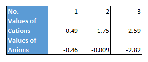
Enter the values of cations and anions. Use the anion values in the negative as shown below.

To prepare data for the Scatter chart, arrange cation and anion data in columns. Select the cation values while holding down the Ctrl key, select the anion values and also select the sample name. Copy these selected cells (Ctrl+C).

Right-click on empty cell -> Paste special -> Transpose
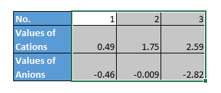
Select the transposed data (the cells containing the rearranged cation and anion data from the previous step).
How to plot a stiff graph?
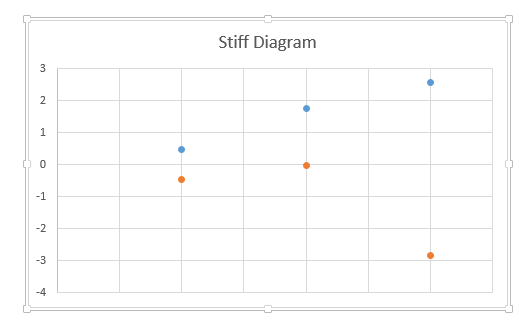
Now, go to Insert -> Charts -> Insert Scatter
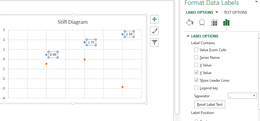
Assign the data labels according to the values in the first table. Select the blue dots by clicking -> right-click -> format data labels.
Select a value from the cells and then provide the range of cation names.

Format Data Labels -> Size and Properties -> Text Direction -> Rotate 90 degree
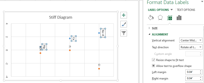
Select free form diagram from Insert -> Shapes -> Freeform. Click on the dots to connect them into the shape below.
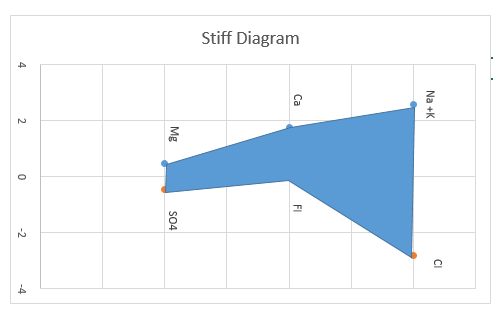
Remove the gridlines. Copy the chart and paste it as an image. Then Format -> Rotate 90 degree.
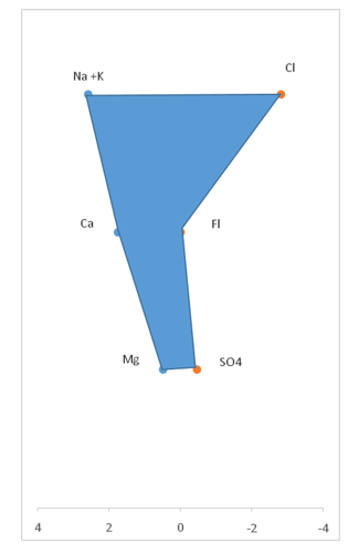
To delete the point colors, right click on them and select color as white.
To add a horizontal axis line for reference, right-click on the chart, go to Format Axis. In the Format Axis pane, under Axis Options, in the Horizontal axis crosses section, choose Axis value and set it to 0 (zero). This will draw a horizontal axis at the zero concentration level.
Stiff Diagrams use color to distinguish cations and anions. Typically, cations are represented with blue/green shades and anions with red/orange/yellow shades. Select the freeform shape you drew. Go to Shape Format tab. Use Shape Fill and Shape Outline to apply appropriate colors. For example, fill the polygon with a light blue or light green and use a slightly darker shade for the outline.
Your Stiff Diagram is ready to use.


Leave a Reply