Difference chart
A difference chart, also known as a change chart or a delta chart, is a type of chart that shows the difference between two data sets over time (e.g. month, quarter). The difference chart is used to highlight the changes in the data sets, making it easier to visualize trends and patterns in the data.
In this Excel tutorial, you can learn how to insert Difference chart into your spreadsheet.
There are several types of difference charts, including line charts, bar charts, and column charts. The choice of chart type depends on the type of data and the information you want to convey.
Preparation of differential data for a graph
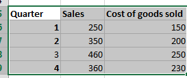
To create a difference chart, you will need two sets of data that you want to compare. Make sure the data is organized chronologically, with the earliest data first and the latest data last. Enter your data in the Excel sheet. Make a column for the lower range. Then leave one column and make a column for the upper range.

To calculate the difference between the two data sets, you will need to subtract one set of data from the other. In the column that had been left blank, enter the heading difference. And use the following method to calculate the values of that column (High – low column).

Repeat this process for each data point. Once the value of the first cell of the difference column is calculated, drag it down till week 5.

Inserting a difference chart
Select the first three columns. Then, Click insert > insert bar chart > Stacked bar chart.
Now, right-click on the blue part of the chart and click format data series. A box will appear on the screen.
Click on the fill and line (marked with blue) in the following screenshot:

Then, click on no fill.

You will get a chart which will look like this:

Delete the legend. (Selected in the image)
Adjust the scale by right-clicking on the horizontal axis then go to the format axis. Adjust the scale under the axis options.
The finished difference chart will look like this.


Leave a Reply