
How to Make a Bar Chart
Every Excel tutorial needs to contain how to make a bar chart lesson. Bar charts are one of the simplest ways to represent a collection of data. Also, creating a bar chart is just a matter of a few clicks in Excel.
This is an ultimate guide to cover up creating and formatting bar charts, types of bar charts and its limitations.
Table of Contents
What is a bar chart?
It’s certainly not rocket science to understand what a bar chart is. It just differs from a column chart in terms of the illustration of bars. But let’s have a quick insight to refresh your knowledge!
A bar chart is a graphical representation of a data comparison. Different categories of data will be compared by means of horizontal bars, proportional to their corresponding values. Categories are visualized on the vertical axis while the comparison values are visualized on the horizontal axis.
However, it’s just as simple as the following image.

Why bar charts?
A comparison of data that belongs to a set of categories, is typically plotted on a bar chart or a column chart. But a bar chart is chosen over a column chart if you have lengthy labels for the set of categories. This type is widely used specifically in financial analyses.
Simply when you need to represent a particular set of data to be summarized or gradually fluctuates over time, bar chart of course should be the pick over the other types.
Let’s run through each step to draw your data set into nicely organized bars in Excel!
How to create a bar chart?
First, your data set has to be organized in the way which allows to plot them into a bar chart in Excel.
Here’s a simple example of a distribution of product sales.

Make sure the data set is arranged in a way where the labels of categories are on the left column while the corresponding values are on the right column as depicted.
You can definitely re-arrange the order of the categories as you desire.
Now you have to select the entire area to determine the data set that needs to be plotted. To do that, left-click your mouse and drag it to highlight the area or simply click ‘Ctrl + A’ after selecting a cell within the data set.
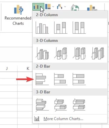
Here’s a visual-aided step wise guide to insert the bar chart to plot the data set.
Navigate to Insert tab in the topmost toolbar.

Now, click on “Insert Column or Bar Chart”.

Select “Clustered Bar” under “2-D Bar” section.
Viola! Now, you can see the Excel chart is plotted quickly in the middle of spreadsheet just as the following image.
You can click on the selected rectangular box of the chart and drag and drop to relocate the chart anywhere in your Excel spreadsheet.
The area of data set is now highlighted as shown below to determine which data set is plotted in the chart.

You might not be happy with the default version of the plotted chart in Excel. So, there are a bunch of formatting tools available to add some tweaks to enhance or alter the details and look-and-feel of your chart.
Let’s discover some of key features out of them.
How to format a bar chart?
You can do formatting of bar chart specifically in two different ways depending on your needs. This tutorial will highlight some of the main features in each way.
Improving or altering details of bar chart
Click anywhere within the outer rectangular box of the chart in order to make sure the chart is selected.
Chart Elements
You can add chart elements to visualize more details of the chart. To do that, click on the ‘Plus mark icon’ that is shown on the top right corner of the chart area.

You can add chart elements to the chart by ticking the check box in front of the desired element and vice versa.
Note: Axes, Chart Title, Gridlines are checked by default.

For an instance, you can enable ‘Data Labels’ to show corresponding values beside each bar.

You can then format the data labels as you desire by double-clicking on the preferred text. A right pane will be appeared while the data labels are selected as shown.

You are given a bunch of nice options to improve the details of each label under ‘Label Options’ in Excel.
Chart filters
There will be certain conditions where you want to hide or highlight specific data in the chart. So, chart filters can accomplish your job as you need them.
For instance in case if you need to hide ‘SHIPS’ which has minimum sales, execute the following steps.
Click on the icon as depicted.
![]()
Now uncheck the check box in front of ‘SHIPS’ and then click on ‘Apply’.

The chart is plotted by hiding the ‘SHIPS’ data as shown below.

Improving or altering look-and-feel of bar chart
Changing style or color theme of chart
Click anywhere within the outer rectangular box of the chart in order to make sure the chart is selected.
Click on the icon as depicted.
![]()
Navigate to ‘Style’ tab and scroll down to select the preferred style to apply. The changes will be immediately affected once selected a style as shown.

You can change the color theme by executing the following steps.
Repeat the same steps under changing the style of the chart. Navigate to ‘Color’ tab and scroll down to select the preferred color palette to apply.
The changes will be immediately affected once selected a color palette as shown.

Changing color or style of chart elements
You can easily change the background color or the outline’s color or style of any element in the chart in Excel.
To do that, right-click on the char area that is surrounded by a rectangular box. A menu will be appeared instantly as shown below.
Select a preferred chart element in which the background color needs to be changed from the drop-down list.

Click on ‘Fill’ icon to select a preferred color, picture, gradient or texture as the background for the selected chart element as shown below.

Click on ‘Outline’ icon to select a preferred color for outline of selected chart element. You can also change the weight and dash style of outlines as you want for any selected chart element.
![]()
Formatting texts
You are allowed to customize the texts that are visible in the chart in the way you prefer. But that can be executed in two different methods as follows.
In order to format the whole text in a single settings option, right-click on an empty space within the outer box of chart. Then select ‘Font’ on the popped-up drop-down.
![]()
You can change the font style, size, effects and character spacing according to your preference and click ‘OK’.

You can format specific text group such as series name, labels of horizontal or vertical axis individually.
To do that, click on the space or on text within the preferred text area to make it selected. Right-click on the same area and then select ‘Font’ on the popped-up menu.

Changing chart title
You can easily change the title by double-clicking on the title’s text on the chart. Then type the preferred text in the title box.

Bar chart types
You can check out different types of bar charts that are available in Excel created for different purposes. So, it’s quite important to leverage the most suitable chart type depending on the data set you have.
Let’s find out what are them and when to use them.
Clustered Bar Chart
If you have got multiple data sets or series that belong to the same category, clustered bar chart is the best option to plot them. Even a single series can be plotted as explained in the step-by-step guide.
Data will be grouped so as the corresponding horizontal bars sharing the same category label on the vertical axis.
Creating clustered bar chart
First organize the data set to determine the details of the chart to be plotted. Make sure to leave the first cell of the category column empty unless you want to visualize the total sales in the chart.
Now select the entire data table to be selected as shown.

Click on “Insert Column or Bar Chart” in ‘Insert’ tab and click on ‘Clustered Bar’ icon to create a clustered bar chart.

Clustered bar chart will be instantly plotted in the same Excel spreadsheet.
Now you can add the chart title as you desire by double-clicking on ‘Chart Title’.
Stacked bar chart
Data of more than one series is stacked in a horizontal bar itself for each category in a stacked bar chart. A particular set of values share the same label of its corresponding category on the vertical axis.
Note: This type of bar chart is not applicable for a single data series.
Creating stacked bar chart
Data table should be organized as shown in your Excel spreadsheet. Make sure the first cell of category column is empty.
Now select the entire data table to determine the area to be plotted.
Click on ‘Insert Column or Bar Chart’ in ‘Insert’ tab and click on ‘Stacked Bar’ icon to create a stacked bar chart.
The plotted stacked bar chart will be instantly shown in the same Excel spreadsheet.

Now you can add the chart title as you desire by double-clicking on ‘Chart Title’

100% stacked bar chart
This is an advanced version of the stacked bar chart where the contribution of each data point is shown proportional to its total of a particular category.
So, this is most suitable to analyze the individual contributions of data series in a particular category.
You can execute the same steps explained under the stacked bar chart to organize the data table.
Then click on ‘Insert Column or Bar Chart’ in ‘Insert’ tab and click on ‘100% Stacked Bar’ icon to create a 100% stacked bar chart.

Plotted chart will be shown as the depicted image in the same Excel spreadsheet and the title can be added as described under the stacked bar chart.

3-D Bar Charts
If you need clustered bar charts or stacked bar charts to be illustrated with a 3-D effect, this feature is available in Excel to achieve that job.
All the bar chart types clustered, stacked and 100% stacked, can be converted to its 3-D version under this.
So, it’s just a matter of clicking on the right icon in the annotated section as depicted in the image.
Click on ‘Insert Column or Bar Chart’ in ‘Insert’ tab and
- Click on the icon annotated as #1 to create 3-D Clustered bar chart or,
- Click on the icon annotated as #2 to create 3-D Stacked bar chart or,
- Click on the icon annotated as #3 to create 3-D 100% Stacked bar chart.

Note: You can download this Excel tutorial file which includes all the types of charts explained in this tutorial, by clicking here.


How To Plot A Dataframe In Pandas • Pandas How To
[…] See also: Matplotlib plot documentation How to check if Pandas dataframe is empty How to insert bar chart in Excel […]