How to Make a Radar Chart in Excel
This Excel tutorial guides you through the process of inserting and formatting a Radar Chart, also known as a Spider Chart or Web Chart.
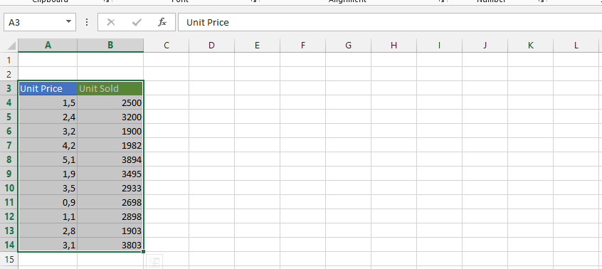
Your data might resemble a simple sales table, containing categories such as phones, online, email, office, and shop.

Inserting a Spider Chart
Select all the data cells. In this example, we’ll choose cells from A3 to E8.

Find and click on the radar chart symbol.
Click on the radar chart symbol to reveal the available radar chart variations. Excel typically offers several radar chart types:
- Radar – Shows data points connected by lines
- Radar with Markers – Shows data points with visible markers at each value
- Filled Radar – Shows the data area filled with color for easier comparison
Choose the radar chart type that best suits your needs. The filled radar chart is often preferred for comparing multiple data series because the colored areas make visual comparison easier.

After selecting your preferred radar chart type, Excel will insert the chart into your worksheet. The chart will automatically use your selected data and display it in the radar format. You can resize and reposition the chart by clicking and dragging its edges and corners.

How to read a Spider Chart?
A Radar Chart differs from regular Excel charts, so it’s crucial to understand how to interpret a spider chart.
- each corner of the spider chart represents a different category of sales
- webs (lines) represent weekly values
- the further from the center of the chart the higher sales
Advantages of Radar Chart
There are a few exceptional advantages of radar charts which you may concider during the data type choise for your data:
- radar chart is excellent to compare two different webs of values (eg. features of two different products)
- can show many information for 2-4 different categories and still remain informative
- this is very well chart to make the decision between two-four different set of values
An Example: I used to play managerial computer games and remember using radar charts to decide which football player to buy. In this scenario, the green web appears much better. His Defending, Speed, Vision, and Attacking skills surpass those in the blue web. You might only consider the skills of the blue footballer if you need Aerial skills or for other factors not visible in the chart (e.g., price, age, etc.).

Similarly, when comparing products for advertising, companies for mergers, or employees for promotion using a Spider Chart, these advantages can help you make informed decisions.


Leave a Reply