How to make 3 axis graph
As you know, it’s easy to draw 2D (with 2 axis) graphs in Excel. You can also draw a 3D chart in Excel, with 3 axes: X, Y and Z.
Table of Contents
How to draw?
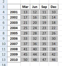
The procedure is very similar to how you draw a 2 dimension graph. Suppose you have data on quarterly sales in millions for the last 10 years, something like the following.

See the data carefully. You have 4 x 10 data fields. Just follow these steps:
Insert 3D chart
Select the data, including labels, in the Insert ribbon tab go to the column and select the 3-D chart.

The chart should now have three axes: the primary axis, the secondary axis, and the third axis.
And that’s it! You’ve just inserted a 3 axis chart. Your 3-axis chart is now ready to use. You can also customize it further by formatting the chart elements, adding labels or data markers, and changing the chart type as needed.

Here are some common customization options:
- Change Chart Type: You can right-click on the chart and choose “Change Chart Type” to switch to a different 3D chart type if needed.
- Format Axis: To adjust the appearance of the X, Y, and Z axes, right-click on them and choose “Format Axis.” Here, you can change axis labels, adjust scaling, and apply other formatting options.
- Add Data Labels: You can add data labels to the chart elements to make it easier to read. Right-click on the chart element (bars or columns) and choose “Add Data Labels.”
- Chart Title and Axis Labels: Don’t forget to add a chart title and labels for the X, Y, and Z axes. This helps viewers understand the chart better.
Rotate and Adjust the Chart
3D charts in Excel allow you to rotate and adjust the perspective to view data from different angles. To do this:
Right-click on bars and select 3-D Rotation to adjust the grade visibility.

Note: For learning purposes, use the table shown above (numbers in an increasing pattern). Otherwise, the result will be fairly unreadable since 3D charts just don’t work on a 2D surface, unless you actually rotate them and get things into perspective.


Leave a Reply