How to Zoom in on Excel Graph
Learn how to zoom in on a chart in Excel to enhance visibility and focus on important data points. It will help you improving visibility of values in your graph.
Chart visibility in Excel is crucial for clear data interpretation and analysis. In this lesson, you will learn how to zoom in your graph.
Zooming Sheet
The simplest way to zoom in on an Excel graph is by adjusting the worksheet zoom level. To do it go to right corner of screen and click + button

Zooming the entire worksheet enlarges both the spreadsheet and the embedded Excel chart.
Changing scale of axis
Another method to zoom into specific chart areas is by adjusting the axis scale in Excel.
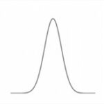
If your chart looks that:

You can change it to that look:

You can easy improve wrong scale yourselves. Right-click axis and select Format Axis.

Change Min and Max values to fit them to your values.

Notice that scale of proper axis starts from $40,25. You don’t need to starts from $0.
Using logarithmic scale
Use a logarithmic scale in Excel charts to improve readability when working with data that spans large value ranges. Use logarithmic scale when there is huge difference between values at your graph.

To zoom in on data range, right-click on the axis and choose Format Axis to set custom minimum and maximum values. Tick Logarithmic scale check box.

The chart now appears more readable, with evenly spaced intervals that highlight differences in your data.


Leave a Reply