Wind Rose in Excel: Create Meteorological Wind Direction Charts
In this Excel lesson, you will learn how to create a Wind Rose chart in an Excel spreadsheet.
What is Wind Rose
Wind Rose is a graphic illustration of long-term meteorological statistics, directions and wind speeds occurring in different places of the globe. You can make a Wind Rose in Excel as well.
On today’s nautical charts are placed “wind roses”. A map for the Atlantic and the Pacific showing the distribution of winds in the area around 5-percent (three hundred miles square) for each month of the year. The arrows show the direction of the wind, and the numbers indicate the strength (of the wind according to the Beaufort scale).
The percentage of time the wind blows from any direction, is measured by the length of the arrow graduated. The number placed in the center of the circle determines the amount of windless periods. The wind diagram is most often divided into 8 to 16 sectors depicting individual directions (N, S, E, W). The radius of filling individual sectors shows how often the wind blows from a given direction.
A wind rose or meteorological wind direction diagram is created by plotting the frequency of wind directions in concentric circles, with each circle representing different wind speeds. This type of polar chart visualization is ideal for showing wind speed distribution and direction patterns at a specific location over time.
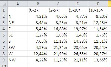
Preparing data for Wind Rose
To create a Wind Diagram in Excel first prepare some data:
- rows – wind directions
- columns – range
- values – speed of wind (percentage)

Preparing the data is the most difficult step here.
Insert the Radar with the Makers chart
Creating a wind rose chart in Excel involves using a radar chart with markers, which is a specialized chart type perfect for displaying multi-directional wind data. To build your wind rose visualization, select your wind data and insert the Radar with Markers chart type.

Once you have created the basic wind rose plot, you can customize it by changing the colors, adding labels, and adjusting the size of the plot. You can also add additional elements to the plot, such as the compass rose and the wind speed legend, to make it easier to interpret the data.
Finally, you can save the wind rose as a picture or chart, or you can copy and paste it into another document or presentation. You can also share the wind rose with others by exporting it to a file format that can be easily opened, such as PDF or PNG.
Wind Rose is ready.

As simple as it is, Only prepare the data and insert the Radar with Makers chart. This is how to get the Wind Rose chart in Excel.


Leave a Reply