How to Add Trendlines in Excel
In this Excel tutorial, you’ll learn how to add and use trendlines in Excel charts to visualize data trends.
What are Trendlines
Trendlines in Excel are helpful for visualizing changes in data over time. A trendline can also be used to forecast future values or estimate past trends based on existing data. This type of forecasting in Excel is related to regression analysis, common in statistics and econometrics.
Trendlines in Excel can be added only to uncumulative and two-dimensional charts. Types of graphs, which can be used to: area, column, line, stock, bar, scatter, and bubble. Trend lines can not be added to the chart: three-dimensional, stacked, radar, pie, surface, and ring.
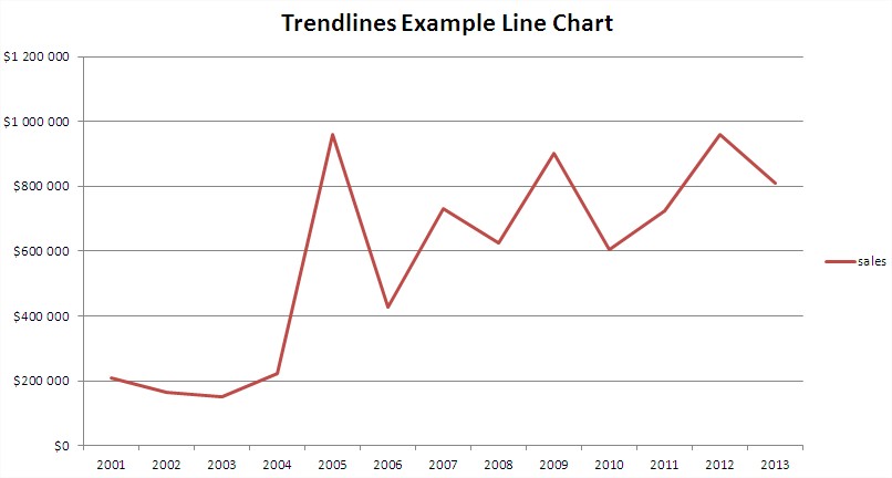
As an example, I created a simple line chart.

Adding a trend line
To add a trendline, first click on the chart to activate it. Then, navigate to the Chart Design tab on the ribbon, and select the Add Chart Element dropdown. Choose Trendline and select from the four basic types available. These are:
- Linear Trendline,
- Exponential Trendline,
- Linear Forecast Trendline,
- Two Period Moving Average.
Linear Trendline for this sample line chart will be like in the picture below.

In this way, you can insert a very simple trendline. You get more opportunities after selecting the More Trendline Options button.

Then the Format Trendline dialog box appears.

This dialog box gives you a lot of options for working with trendlines. For example, let’s see how it will look in the next 10 Forward Forecast periods for your sample trendline.

It’s just a very simple example, but I’m sure you know how to add a trend line and how to use trendline in Excel.


Leave a Reply